ClanCommerce — UI Refinement Across Core Admin Screens
UI Design, Interaction Design, Visual Refinement
Role
Product Designer
Industry
B2B SaaS / Business Management Software
Duration
Scelloo (via internship)

OVERVIEW
ClanCommerce is a business management platform covering CRM, sales, purchasing, payments, catalogue, inventory, and approvals — the kind of product that businesses rely on to run operations every day. I joined the design work during my internship at Scelloo and was given a brief to audit and refine four core admin screens: the group creation flow, the settings hub, the role and permissions configuration screen, and the customer registration form.
This wasn't a ground-up redesign. The screens worked. Users were getting through their tasks. But there's a version of "working" that means functional, and a version that means genuinely efficient — and these screens were stuck at the first one. Spacing was inconsistent, information density was unmanaged in places, visual hierarchy wasn't sharp enough to guide attention quickly, and at least one screen was making admins do more form-filling than the task actually required. The brief was to close that gap: better spacing, better alignment, better visual clarity, and one meaningful structural improvement on the form that needed it most.
Small changes at this level of a product compound quickly. Admin screens are used repeatedly, often under time pressure, by people managing live business data. Reducing the friction in each interaction by even a few seconds, across dozens of daily uses, adds up to real time saved and real errors avoided.
WHAT I REFINED AND WHY
Create New Group — tightening the form and cleaning up the actions column
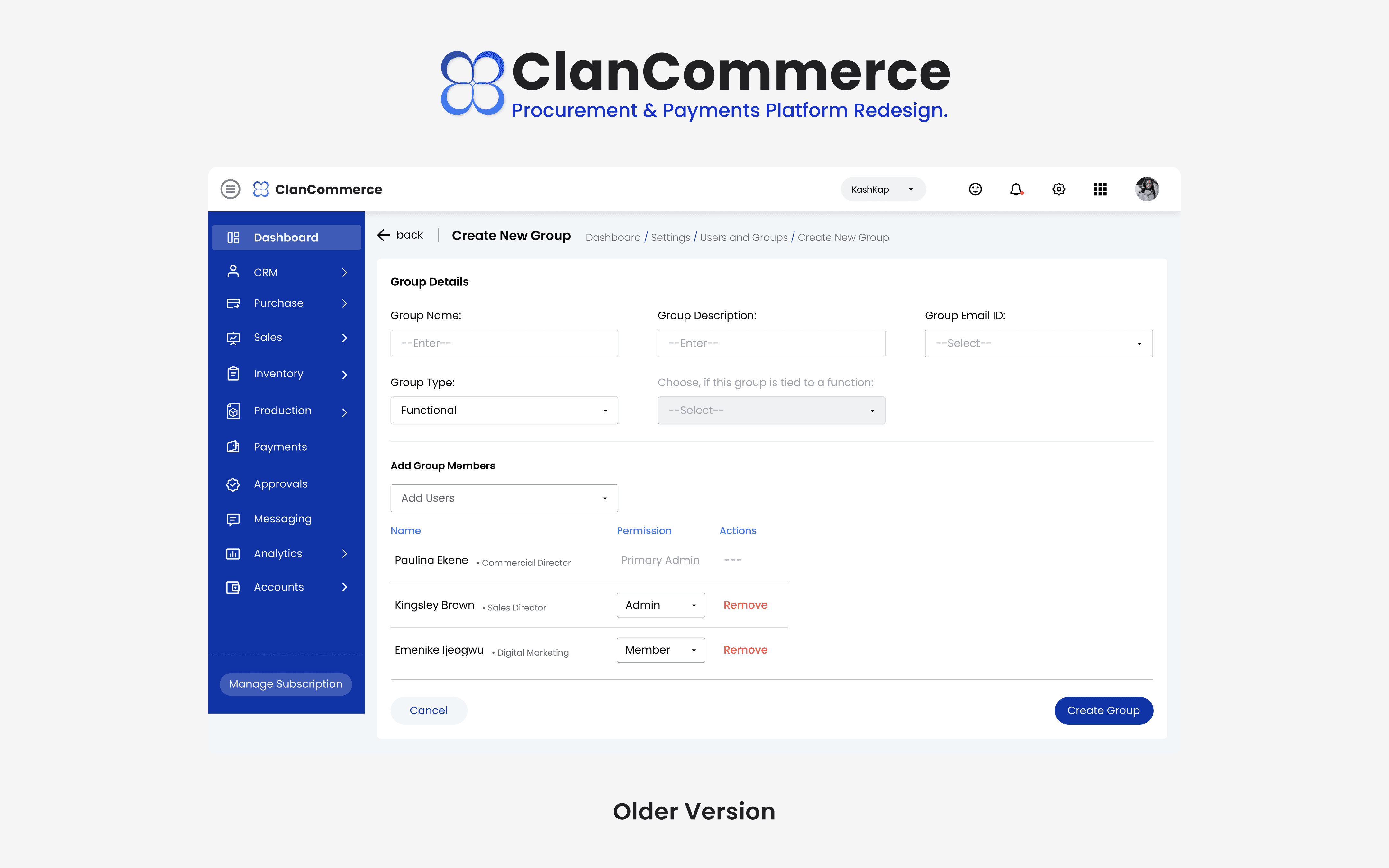
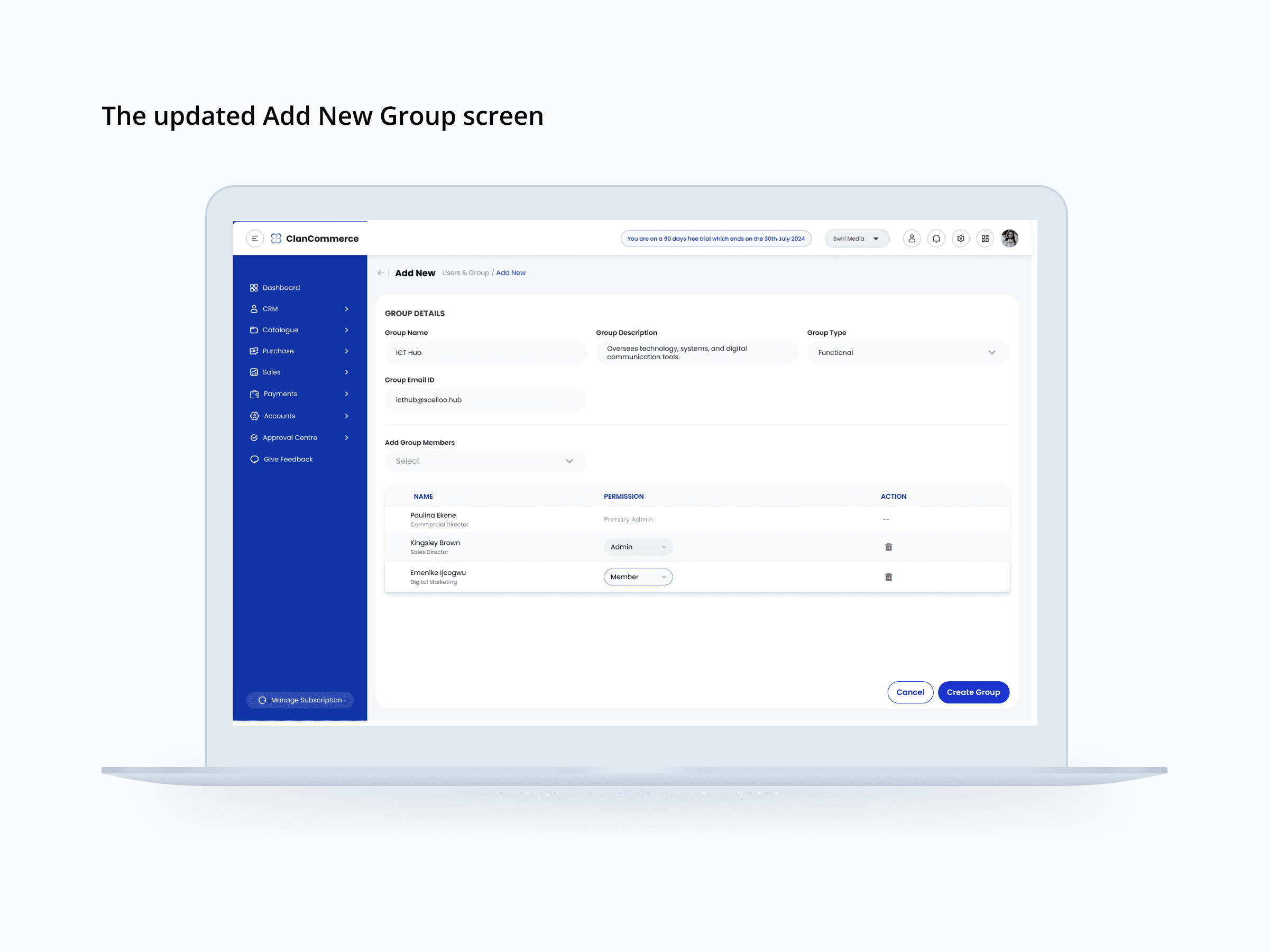
The older version of this screen had the right structure but loose execution. Field labels used colons and varied spacing, the conditional "Choose if this group is tied to a function" dropdown sat awkwardly between the group type selection and the member section, and the actions column used red "Remove" text links — functional, but visually heavy against the rest of the table.
The updated version tightens spacing throughout, removes the conditional dropdown that was adding visual noise without clear benefit to most users, and replaces the text links in the actions column with a compact red trash icon. That last change is worth naming specifically: an icon communicates the same intent as the word "Remove" in a fraction of the horizontal space, keeps the table cleaner, and follows the visual convention most admin users already recognize from other tools they use. The member table now reads as a proper data structure rather than a loose list.
Settings — space, scroll, and icon clarity
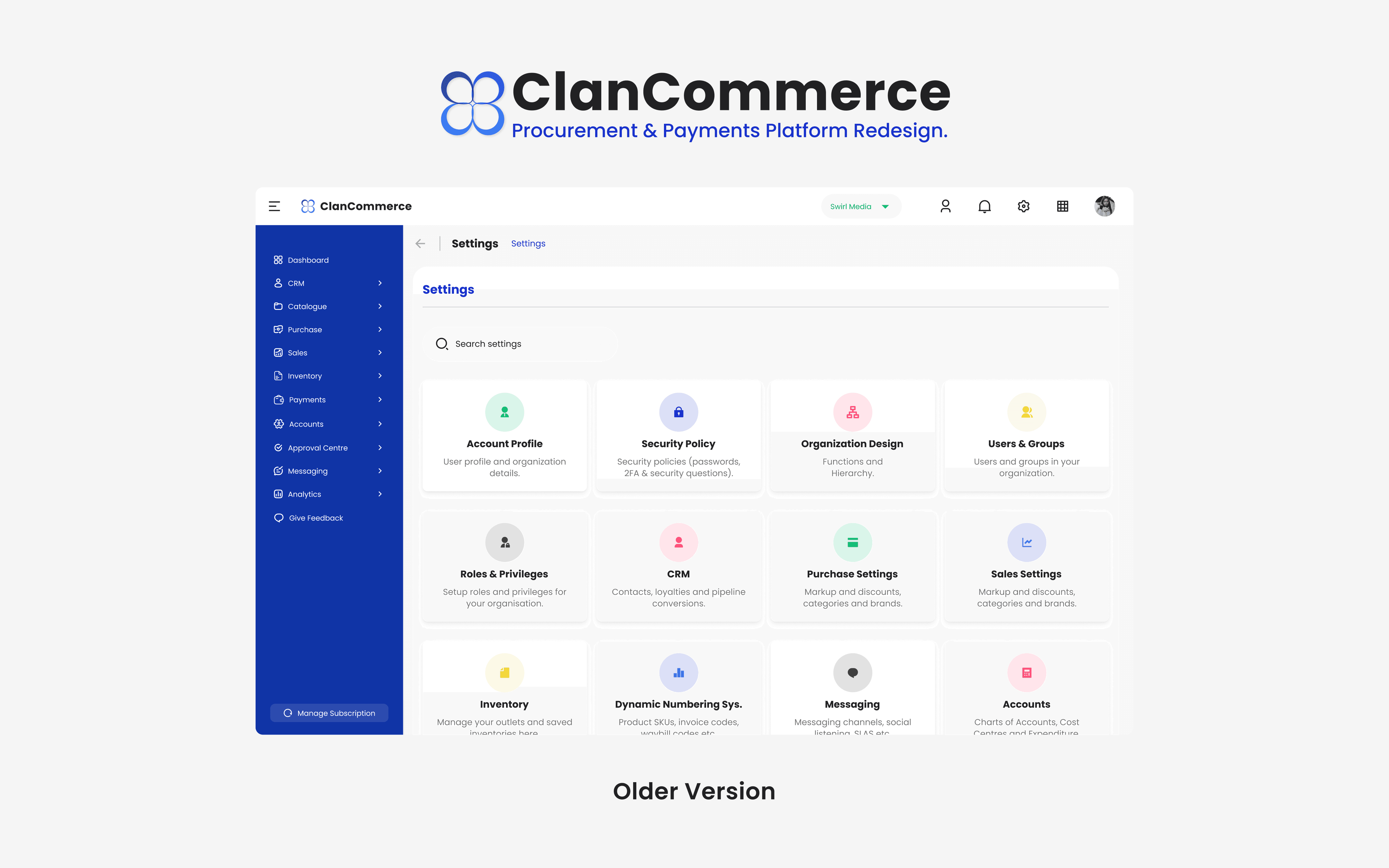
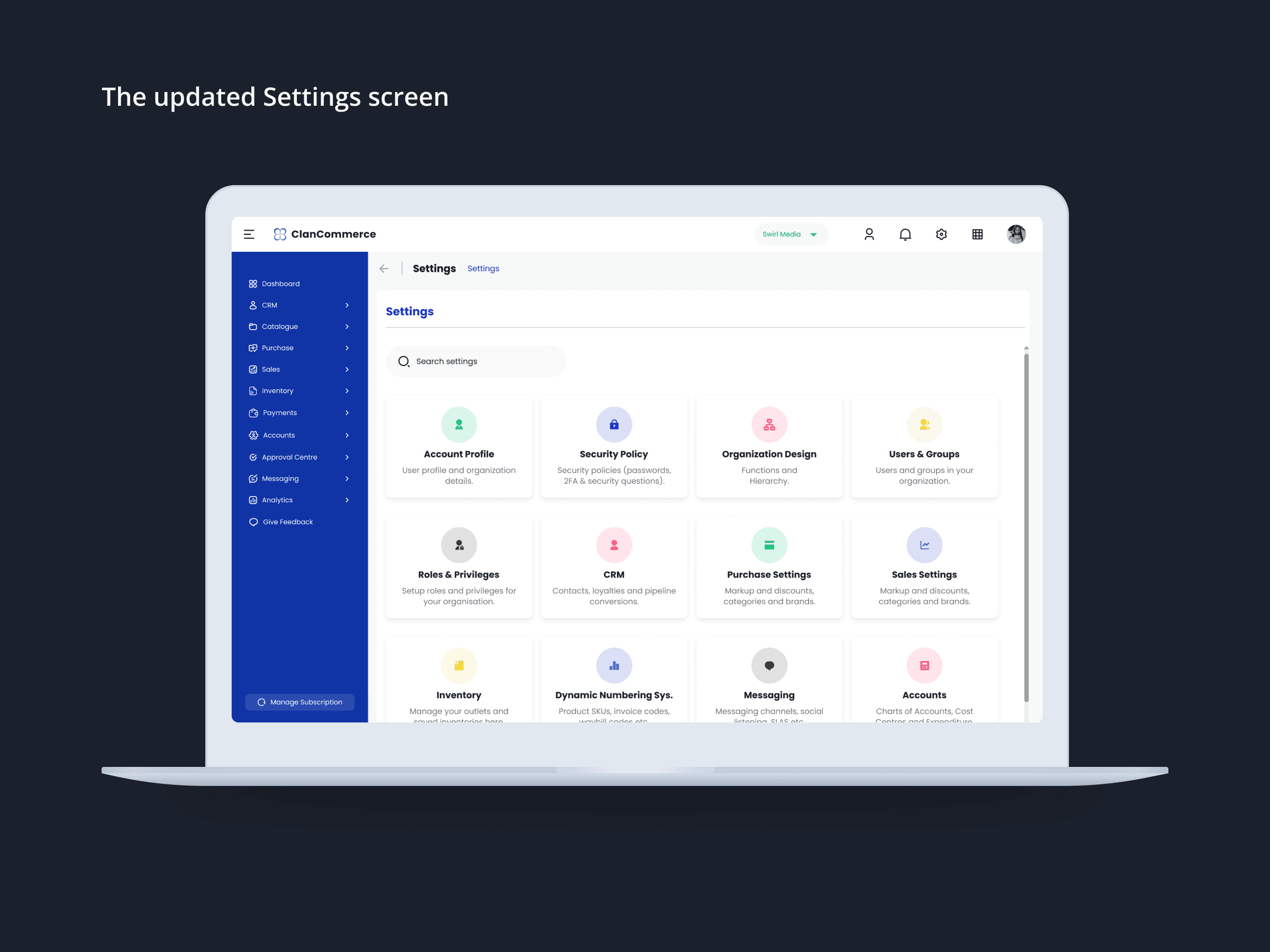
The older settings hub had the right idea — a card grid gives admins visual orientation across twelve configuration categories far faster than a list would. But the execution was tight. Cards had minimal padding, icon circles were small, and the text inside each card was cramped enough that the descriptions barely registered.
The update increases card padding, scales up the icon circles so each category's visual identity has more presence, and adds a visible scrollbar on the right edge of the content area. That last addition is a functional change, not just a visual one. Without a scroll indicator, admins have no signal that more content exists below the visible grid. With it, the interface communicates its own structure — you can see there's more, and you know how to get there. It's a small thing that removes a small but unnecessary moment of uncertainty every time an admin lands on this screen.
Create New Role — hierarchy and scroll containment on a complex configuration surface
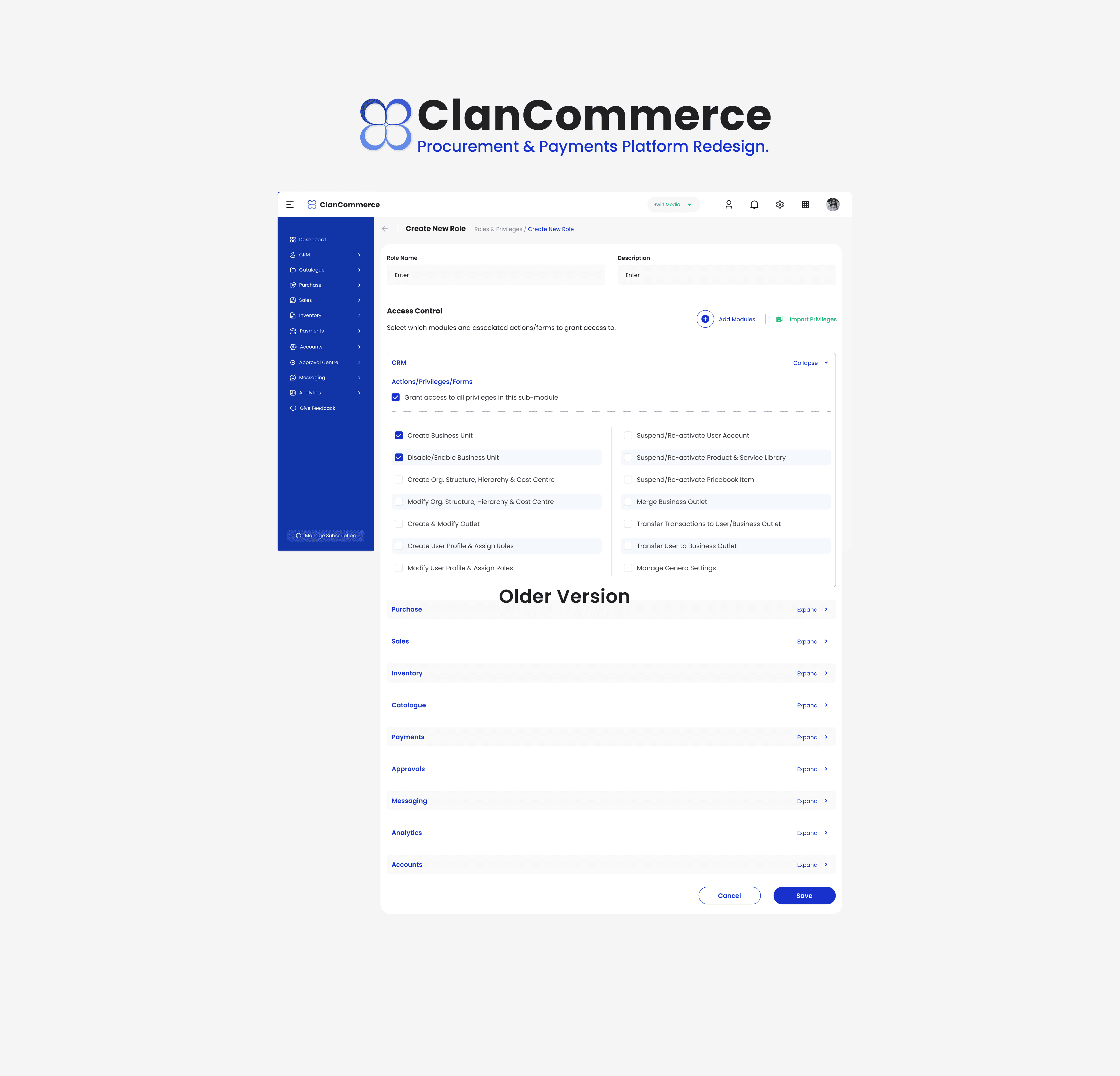
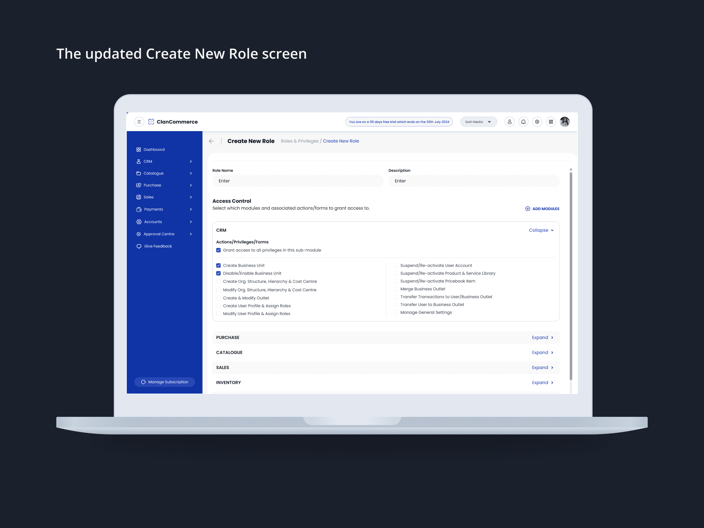
The Create New Role screen carries more information density than any other surface in this set. Configuring a role means making decisions across every functional module the platform covers — CRM, Purchase, Catalogue, Sales, Inventory, Payments, Approvals, Messaging, Analytics, Accounts. Getting the visual hierarchy right here isn't optional; without it, admins lose their place, miss modules, or configure permissions they didn't intend to touch.
The older version displayed the permission list in a wide, full-page layout with typography that didn't do enough to distinguish between module headers, sub-headers, and individual permission checkboxes. The two-column layout within the CRM module felt dense rather than organized.
The updated version introduces a contained, scrollable content panel with a visible scroll indicator — keeping the page structure stable while the permission list scrolls within its own bounded area. The left navigation is tighter and more controlled. The collapse/expand controls per module are visually clearer. The overall effect is a screen that feels manageable rather than overwhelming — which matters enormously when the task requires careful, deliberate configuration decisions across ten or more modules.
Customer Registration — progressive disclosure where the form needed it most
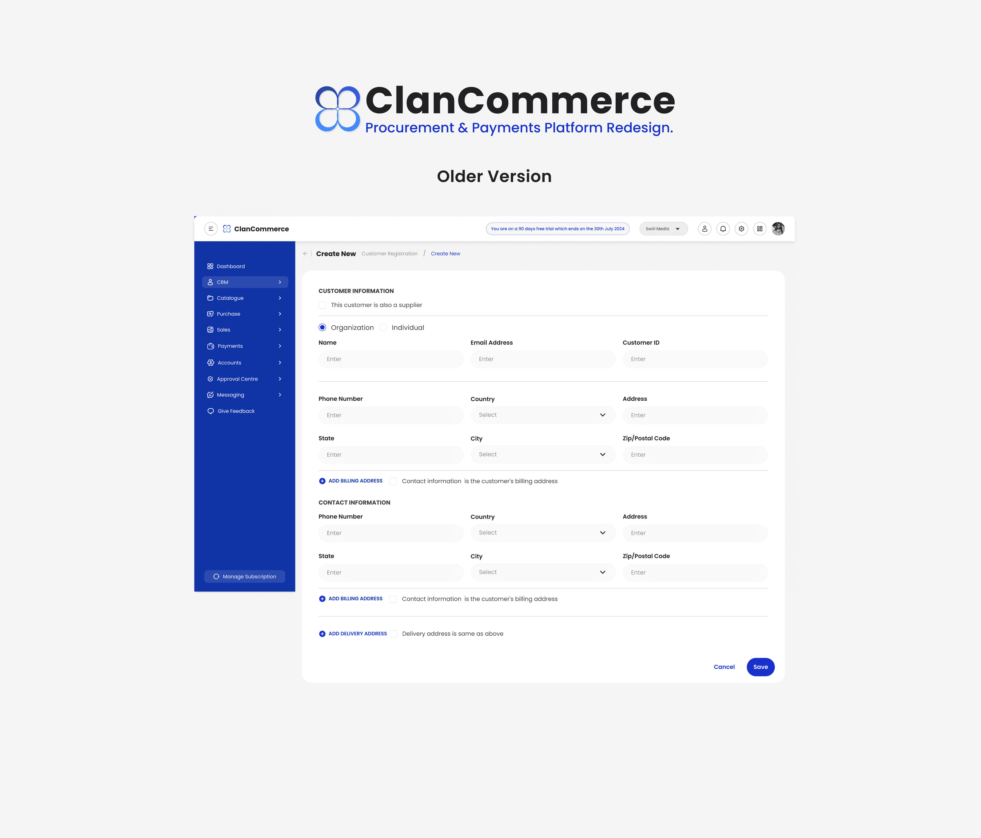
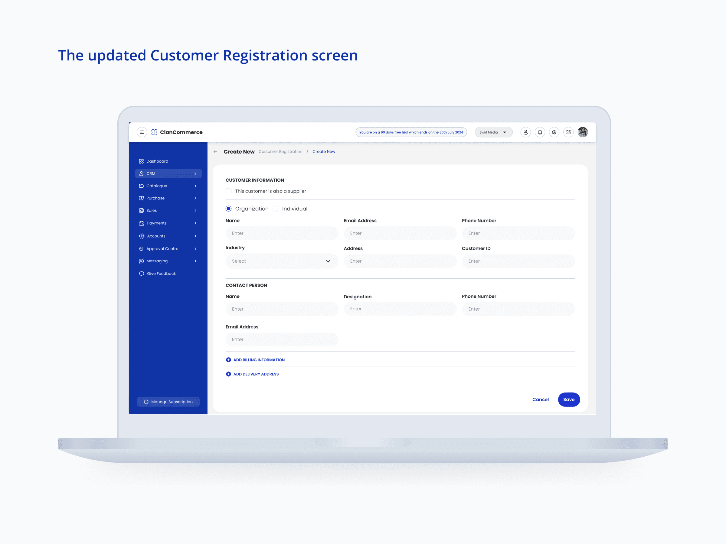
This was the screen with the most meaningful structural change, and it's worth explaining why that change was the right call.
The older form expanded all address fields inline — both the main contact address and a separate contact information block were fully visible on load, each carrying Phone, Country, Address, State, City, and Zip fields. For a form that most admins will fill in frequently, that's a lot of visual weight for information that isn't always required upfront. The form felt longer than the task warranted, and the repetition of two nearly identical address blocks made it easy to lose track of which section you were filling in.
The updated form collapses billing and delivery addresses behind clearly labelled progressive disclosure links — "Add Billing Information" and "Add Delivery Address" — so they only expand when an admin needs them. The default view is dramatically lighter: Customer Information at the top with Name, Email, Phone, Industry, Address, and Customer ID in clean three-column rows, followed by a Contact Person section with its own clearly labelled fields. The form reads as two distinct tasks — who is this customer, and who do we contact — rather than one long continuous field list.
An Industry field was also added, which wasn't present in the older version. This is a CRM-level data point that improves how customer records can be segmented and filtered downstream — a small addition with meaningful implications for anyone using the platform's sales and reporting functions.
OUTCOME
Across all four screens, the refinements applied a consistent set of principles: tighter spacing, sharper visual hierarchy, cleaner component choices, and one meaningful structural simplification on the form that needed it most. The result is a set of admin screens that feel more considered — not because they look dramatically different, but because the small things that were creating unnecessary friction have been resolved.
Refinement work at this level is easy to undervalue because the changes aren't dramatic. But the measure isn't how much changed — it's whether admins can complete these tasks faster, with fewer errors, and with more confidence that the interface is working with them rather than against them. That's what these updates were built to deliver.
REFLECTION
This project taught me something specific about working on existing products: the constraint isn't creativity, it's judgment. When you're refining rather than rebuilding, you have to be precise about what's actually causing friction versus what just looks different from how you might have designed it from scratch. Not everything that could be changed should be. The job is to find the things that genuinely slow people down and fix those — without disturbing the parts that already work.
The customer registration form was the clearest example of that. The progressive disclosure on the address fields wasn't about making the form prettier. It was about recognising that most users don't need all that information on screen at once, and that showing it anyway was making the task feel heavier than it is. That's the kind of call that requires understanding how the form is actually used, not just how it looks.
That discipline — knowing what to change and what to leave alone — is one I'll carry into every product refinement brief I work on.
Other projects

MoveSmart — Multimodal Urban Mobility App
UX Research, Interaction Design, Design System, UI Design, Prototyping

Handy — On-Demand Handyman Service App
Designing a simple, trustworthy mobile experience that helps users find and book home repair professionals without stress or confusion
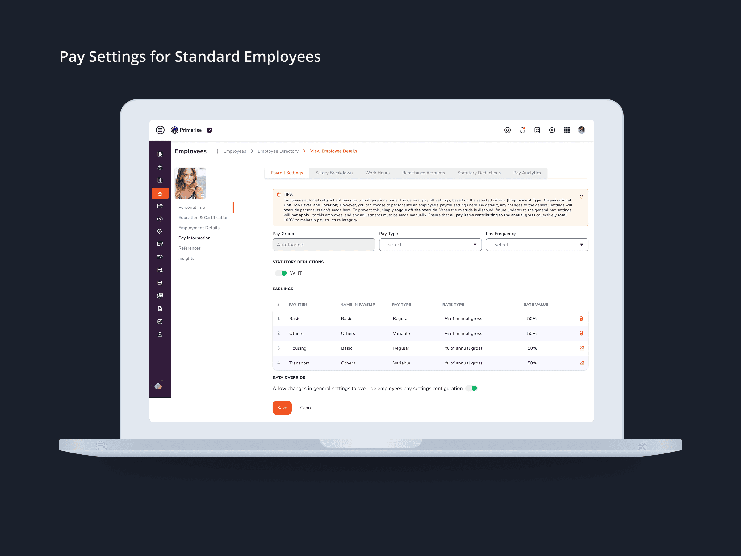
Designing Clarity into Complex Pay Configuration for a Multi-User HR Platform
UI Design · Component Design · Cross-functional Collaboration

MuleEx — Shipment Timeline (Admin View) Web · Admin HQ Users · Internal Ops Tool
Web UI

Delivery Completion & Customer Rating Modal — MuleEx
Mobile UI Design, Visual Redesign, Usability Improvements