MuleEx — Shipment Timeline (Admin View) Web · Admin HQ Users · Internal Ops Tool
Web UI
Role
UX/UI Design Intern
Industry
Supply chain & logistics industry.
Duration
MuleEx

OVERVIEW
When you're managing logistics across multiple Nigerian states, the most dangerous thing isn't a delayed shipment; it's not knowing a shipment is delayed until it's already a problem. MuleEx is a partner shipping platform operating across that scale, and for the admin staff coordinating it all from HQ, visibility was the gap that kept creating downstream issues.
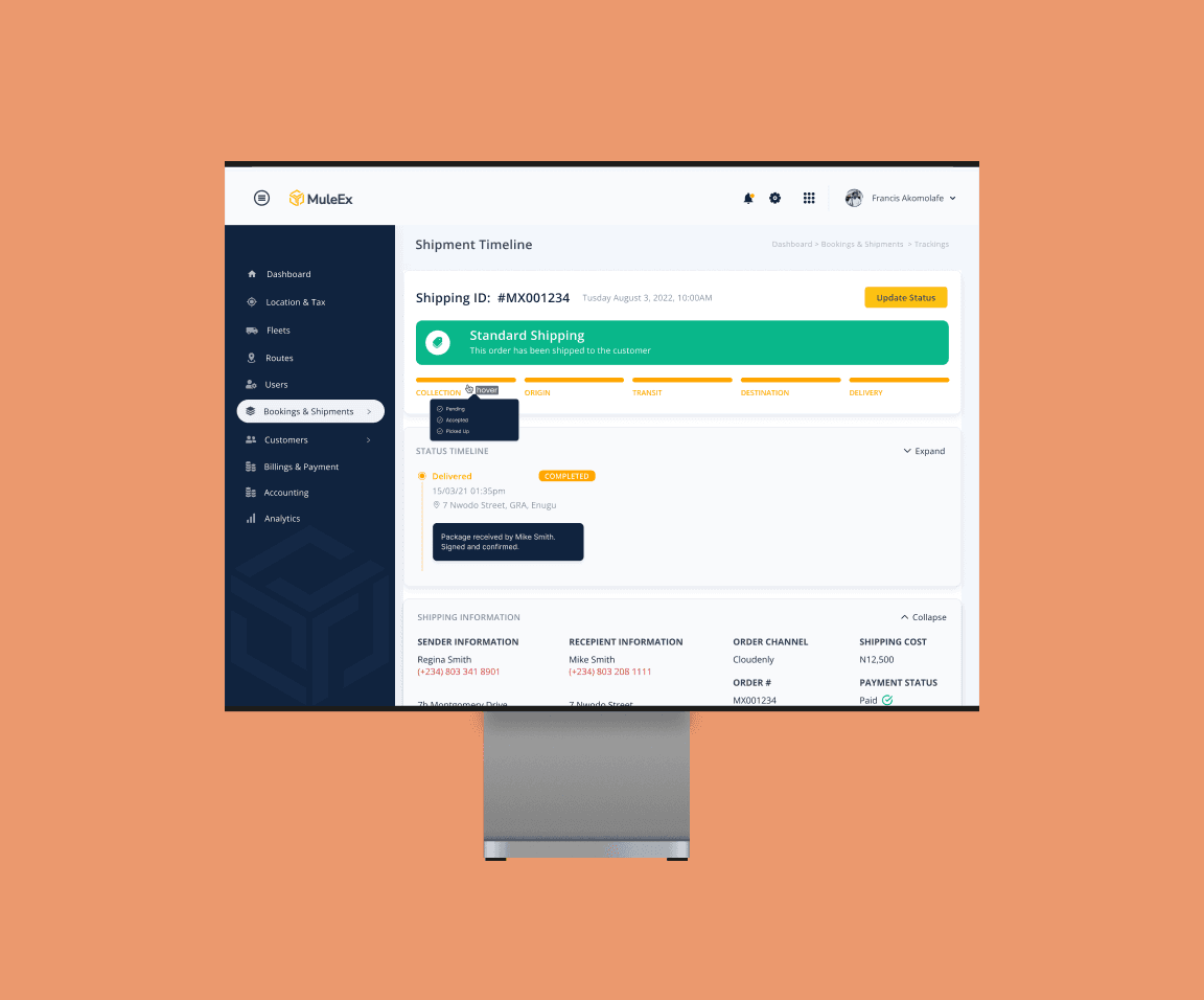
This was a real product with real operational stakes; not a concept exercise. I was brought in as part of the design work on the platform and tasked with building the Shipment Timeline from scratch: a dedicated screen that would give admins a complete, structured view of any shipment's progress at any point in its journey. No more piecing together status updates from separate sources. One screen, full picture.
THE PROBLEM
Before this screen existed, admin users had no dedicated interface for tracking a shipment's granular progress. Status information existed in the system, but there was no structured way to read it; no visual hierarchy that told you at a glance whether a shipment was on track, where it had been, who had touched it, or what had happened when something went wrong.
For a single shipment, that's manageable. For an admin managing dozens simultaneously, it compounds fast. Every check takes longer than it should. Questions from partners or customers require manual digging. And when something goes wrong, tracing the cause means reconstructing a timeline from scattered data rather than reading it from a single view.
The problem wasn't a lack of information; it was a lack of structure. The data existed. The design's job was to make it legible, fast, and trustworthy at operational volume.
DESIGN DECISIONS
1. A stepper progress bar anchored in how people actually think about logistics
A shipment's journey has a natural shape in people's minds: it gets collected, moves through an origin hub, travels in transit, reaches a destination hub, and gets delivered. That mental model exists before anyone opens an interface. The design's job was to mirror it, not replace it.
A horizontal stepper maps directly onto that shape — Collection → Origin → Transit → Destination → Delivery — giving admins an immediate, high-level answer to "where is this shipment?" without reading a single line of text. Completed stages are filled. The active stage is highlighted in amber. Upcoming stages stay grey. The state of the entire shipment is legible in under a second.
The amber highlight is a deliberate choice worth naming. In logistics, the most operationally relevant stage is always the current one; where the shipment is right now. The colour isn't decorative; it's directing attention to the thing that needs it most. Admins scanning across multiple shipments can orient themselves instantly, without having to parse each screen from scratch.
2. Hover tooltips that surface detail without creating noise
Each top-level stage contains multiple granular sub-statuses underneath it. Showing all of them simultaneously would turn a clear progress bar into a wall of information; and at operational volume, that defeats the purpose. The stepper needs to stay readable as a quick orientation tool, not become another thing to parse.
Hover states solve this cleanly. Each tooltip reveals the sub-steps for that stage on demand, using consistent visual language throughout: a checkmark circle for completed steps, a filled white dot for the current active step, and an outlined circle for steps not yet reached. The system communicates state without requiring users to learn anything new; the visual logic is immediately intuitive.
The underlying design principle here is progressive disclosure: lead with what most users need most of the time, and make the detail available for when it's needed without making it unavoidable. Admins doing a quick check don't pay the cost of full granularity. Admins investigating a specific issue can access it in one hover. Both use cases are served without compromise.
3. A chronological status timeline for full traceability
The stepper tells you where a shipment is. The timeline tells you everything that happened to get it there; and in a logistics operation, that second layer of information is what makes accountability possible.
Below the stepper, a detailed timeline lists every status event in reverse chronological order, with timestamps, locations, and — where relevant — a note identifying which staff member made the update. Not just "shipment updated" but "Shipment updated by Amaka Chukwu, Manager, Delta Branch." That level of attribution turns the timeline from a status log into an audit trail.
This matters for two reasons. Operationally, it gives admins the ability to reconstruct exactly what happened and when, without contacting anyone or pulling separate reports. Organizationally, it creates accountability at the individual level — the kind that makes a team more careful and makes issues easier to address when they do occur. A complete, attributable history isn't just a UX feature. It's an operational governance tool.
4. Collapsible sections to manage information density without hiding context
The timeline screen carries three distinct categories of information: Status Timeline, Shipping Information, and Order Items. Each one contains significant detail. Displaying all of it at full expansion by default without any structure would create a screen that's technically complete and practically unusable.
Collapsible sections give admins control over what they're looking at without forcing them to go looking for things. Each section can be collapsed independently, so an admin focused on the timeline doesn't have to scroll past shipping metadata and item lists to get back to it. An admin reviewing order details can collapse the timeline and work without visual noise.
The default state matters here. All sections open on load; because the worst version of a collapsible section is one that hides information an admin urgently needs and doesn't know to expand. Collapse is always the user's choice to make, not the design's assumption about what's relevant. Starting expanded respects that.
OUTCOME
The Shipment Timeline gave MuleEx admin staff something they didn't have before: a single, structured source of truth for the full life of a shipment. From the high-level phase view at the top to the granular event history below, every piece of relevant information is in one place, organised for speed, and built for the reality of managing high volumes.
The design handles both in-progress and completed shipment states cleanly. For a shipment still moving, the stepper shows current position and what's ahead. For a completed delivery, the full timeline populates and the stepper reflects end-to-end completion. The interface doesn't need to change shape between states; the same structure works across both, which matters for admins who are context-switching between many shipments at different stages simultaneously.
REFLECTION
Working on a live product used by a real operations team is a different design experience from working on a concept. The constraints are harder, the feedback is more direct, and the consequences of a confusing interface aren't hypothetical; someone's job gets harder, or a shipment issue takes longer to resolve than it should. That pressure clarified my thinking on what actually matters in operational tool design: speed of comprehension, not elegance for its own sake.
The next iteration I'd prioritize is a filter or search function within the status timeline itself. For shipments with long, complex histories, being able to jump to a specific stage, date range, or staff member's updates would meaningfully reduce the time cost of investigation for power users. Right now the timeline is comprehensive; the next step is making it navigable at the extremes.
More broadly, this project deepened how I think about information hierarchy in admin interfaces. The decisions that mattered most weren't visual; they were structural. What gets shown by default and what gets revealed on demand. What gets summarized and what gets shown in full. What earns its own section and what belongs inside another. Getting those calls right is what separates a screen that looks organized from one that actually makes people's work faster.
Other projects

MoveSmart — Multimodal Urban Mobility App
UX Research, Interaction Design, Design System, UI Design, Prototyping

Handy — On-Demand Handyman Service App
Designing a simple, trustworthy mobile experience that helps users find and book home repair professionals without stress or confusion

ClanCommerce — UI Refinement Across Core Admin Screens
UI Design, Interaction Design, Visual Refinement
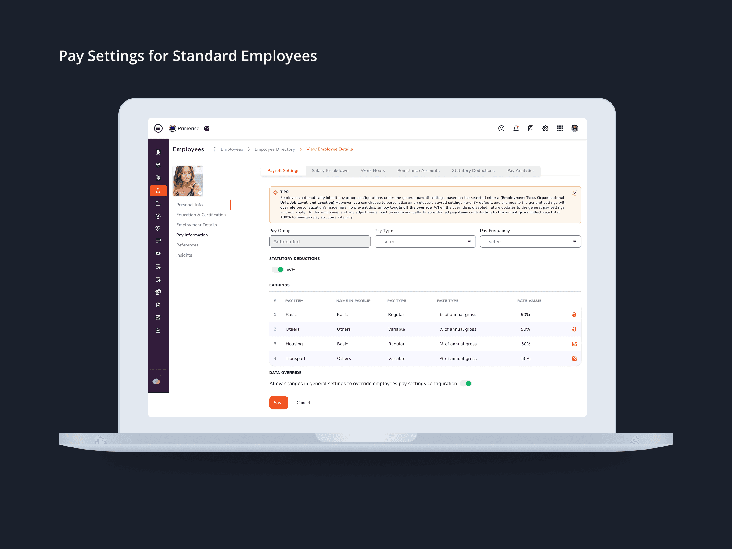
Designing Clarity into Complex Pay Configuration for a Multi-User HR Platform
UI Design · Component Design · Cross-functional Collaboration

Delivery Completion & Customer Rating Modal — MuleEx
Mobile UI Design, Visual Redesign, Usability Improvements