Home from Home Groom Room — A Site Built From Their Own Reviews
Mobile UI Design, Visual Redesign, Usability Improvements
Role
Product Designer — Research, Art Direction, Prototyping (Figma + Lovable), Design QA
Industry
Local Services — Pet Care
Duration
Home from Home Groom Room


Sonia and Nicola run a dog grooming studio out of their home in Coventry. Five stars on Google, loyal clients, the kind of reputation most businesses spend years trying to build. And yet if you searched for them online, you'd find almost nothing — just a bare listing, no website, nowhere for a stranger to actually see what makes them worth trusting with their dog.
That gap is where this project started.
Before I designed anything, I did what I always do first: I read. Not the business's own description of itself, but what real customers had written about them. And one thing kept showing up, again and again, in review after review, completely unprompted — people talking about getting a photo or a short video sent to their phone while their dog was being groomed, not just a before-and-after shot at pickup. Nobody asked for that. Sonia and Nicola just do it. And it's clearly the reason people come back for years.
That became the whole point of the site. Not a list of services with a generic "About Us" paragraph bolted on top, but a design built around the one thing their actual customers can't stop mentioning. The real reviews went straight onto the page, word for word — because nothing sells trust faster than a stranger's honest words, especially when you're trying to convince someone to leave their dog with people they've never met.
I built the first version fast, using AI tools — Figma AI for the concept, Lovable to bring it to life. But fast doesn't mean unchecked. When I reviewed that first draft the way I'd review any junior designer's work, I caught something worth catching: a couple of specific claims about their equipment that sounded convincing but weren't actually true, or at least weren't anything I could confirm. AI is good at sounding certain. It isn't always right. So I fixed it before it ever reached them — because the one thing worse than no website is a website that quietly lies about you.
What Sonia and Nicola received wasn't a pitch or a mockup they had to imagine finished. It was a real, working site — warm, personal, built to feel like an extension of how they actually run their business, not a template with their name typed in. Mobile and desktop both, ready for their own photos, one message away from being live. It's currently sitting with them, waiting on a reply.
This is the part of the work I care about most, and it's the same instinct I bring to every product I touch: look past what a business says about itself, find what its own customers already believe, and build from there. Tools can move fast. Judgment is what makes the result worth trusting.

Other projects

MoveSmart — Multimodal Urban Mobility App
UX Research, Interaction Design, Design System, UI Design, Prototyping

Handy — On-Demand Handyman Service App
Designing a simple, trustworthy mobile experience that helps users find and book home repair professionals without stress or confusion

ClanCommerce — UI Refinement Across Core Admin Screens
UI Design, Interaction Design, Visual Refinement
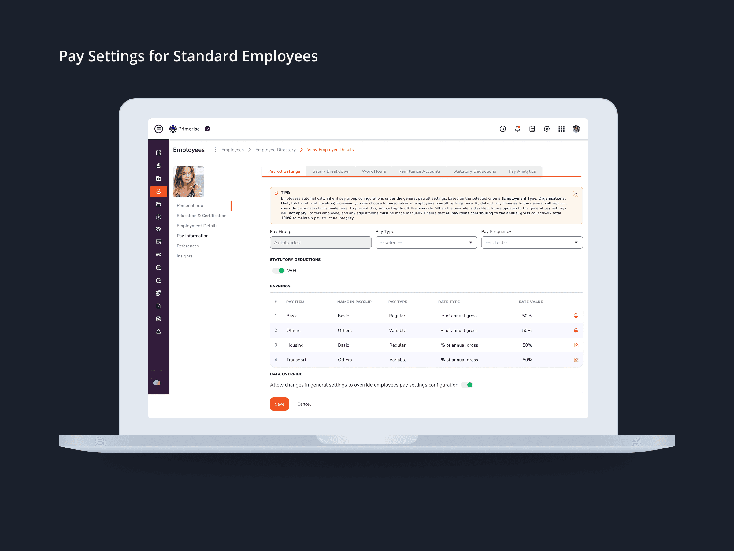
Designing Clarity into Complex Pay Configuration for a Multi-User HR Platform
UI Design · Component Design · Cross-functional Collaboration

MuleEx — Shipment Timeline (Admin View) Web · Admin HQ Users · Internal Ops Tool
Web UI

Delivery Completion & Customer Rating Modal — MuleEx
Mobile UI Design, Visual Redesign, Usability Improvements