Delivery Completion & Customer Rating Modal — MuleEx
Mobile UI Design, Visual Redesign, Usability Improvements
Role
UX/UI Designer
Industry
Supply chain & logistics industry.
Duration
MuleEx

OVERVIEW
Delivery riders are the last human touchpoint in any logistics chain. What happens in the final sixty seconds of a completed job — whether a cash payment is acknowledged, whether a difficult interaction gets flagged, whether the rider feels the platform registered that the job is done — shapes how the whole experience lands. For the rider, it's the difference between a tool that respects their time and one that doesn't.
MuleEx is a logistics platform connecting businesses with delivery riders for shipment fulfilment. The rider-facing mobile app is the primary tool drivers use throughout a delivery, from pickup to drop-off. But when a job was completed, the app simply stopped. There was no closing interaction, no confirmation of payment handling, no way for a rider to flag a problem with a customer. The delivery ended and the app moved on, as if nothing had just happened.
This modal is what I designed to close that gap — a single, contained interaction that handles delivery confirmation, cash collection acknowledgement, and customer rating in one flow, without adding meaningful friction to a rider who has another job waiting.
THE PROBLEM
Two operational gaps existed at the point of delivery completion, and they were related enough that solving them separately would have created more friction than solving them together.
The first was a cash collection blindspot. When a rider collected cash from a customer on delivery, the platform had no mechanism to confirm that collection at the point of handoff. The record existed downstream, but there was no moment where both the rider and the system explicitly acknowledged what had just happened. In a cash-dependent market, that ambiguity creates real risk — disputed collections, unresolved discrepancies, and no clear audit trail when something doesn't match.
The second was the absence of any rider feedback loop. The platform had no way to capture rider sentiment about customer behaviour. Difficult interactions — refused packages, incorrect addresses, hostile customers — went unrecorded and unresolved. Over time, that silence accumulates into a data gap that operations teams can't act on because they can't see it.
Neither gap was dramatic on its own. Together, they meant the platform was ending every delivery interaction with less information than it needed, and riders were being given no signal that the platform cared about their experience at all.
WHAT I DESIGNED AND WHY
A modal over the map, not a new screen
The first design decision was structural, and it shaped everything that followed. Rather than routing the rider to a separate post-delivery page, the flow is a bottom-sheet modal that overlays the live map view. The map stays visible in the background throughout the interaction.
This isn't just an aesthetic choice. The visible map keeps the interaction contextually grounded — the rider is closing out this specific delivery, at this specific location, not filling in a form somewhere detached from what just happened. It also signals containment: this interaction is brief, bounded, and happening right here. For a rider whose attention is already moving toward the next job, that signal matters.
Delivery confirmation and cash collection acknowledgement in one view

The modal opens with a checkmark and a "Delivery Completed" message. This gives the rider immediate reassurance that the system has registered the action — a small thing that carries real weight when you're dependent on a platform to accurately log your work.
Below the confirmation, a system note surfaces explicitly: cash was collected and will be treated as a direct collect. This is doing operational work disguised as a UI detail. Both the rider and the platform now have a clear, timestamped record of how payment was handled at the exact moment of handoff. The ambiguity that previously existed at this point — was it collected? did it register? — is removed entirely. For operations teams reconciling cash payments across dozens of daily deliveries, that confirmation is the difference between a clean record and a dispute.
Binary rating — deliberate simplicity, conditional depth
The rating mechanism is a thumbs up / thumbs down. That choice will look obvious until you consider what it's replacing.
A star rating or numerical scale asks the rider to make a calibrated judgement about something that happened minutes ago, under time pressure, before their next job. That calibration takes cognitive effort, and at this moment in the flow, cognitive effort is exactly what needs to be minimised. Binary removes the decision entirely. Something was fine or it wasn't. The rider doesn't need to decide between three stars and four.
But the more considered design decision is what happens after the choice is made. When the rider selects thumbs up, the flow stays clean — one more tap to submit and they're done. When the rider selects thumbs down, a comment field appears. No comment field exists until it's needed, and it only appears when there is something to say.
This conditional reveal is the design doing two jobs simultaneously. It keeps the positive path fast and frictionless for the majority of deliveries that go smoothly. And it captures meaningful detail when something went wrong, without making every rider pay the cost of that capture. The interface adapts to the rating rather than applying the same structure regardless of context.
Optional comment field for issue reporting

The comment field that appears on a negative rating gives riders space to describe what happened — a difficult customer, an incorrect address, a refused package. It is optional and capped at 300 characters.
Both of those constraints are deliberate. Optional means riders aren't held hostage to a text field before they can move on — the thumbs down alone is a valid, complete submission. The character cap signals that a brief note is all that's needed; this isn't a formal incident report. Together they create an outlet that feels low-stakes enough to actually use, which is the only way to get consistent data from it.
For operations teams, even a short note — "customer refused to open the gate" or "address didn't exist" — is significantly more useful than a thumbs down with no context. It turns sentiment into something actionable.
Acknowledgement confirmation
After submitting, a separate confirmation modal closes the loop with a success icon and a brief thank-you message. The rider knows their input was received. The interaction is finished.
This step is easy to undervalue. But in products used by people doing physical, often stressful work, the feeling that the system acknowledged you matters. A submission that disappears into silence doesn't feel like a closed loop — it feels like it might not have registered. The acknowledgement screen removes that uncertainty and treats the rider's input as something worth confirming, because it is.
OUTCOME
The modal is currently in review for implementation. If shipped, it introduces two things the rider side of the platform previously had no version of: a confirmed cash collection record tied to the exact moment of handoff, and a structured feedback mechanism tied to individual jobs rather than generalised sentiment.
The design also does something less visible but worth naming: it signals to riders that the platform is paying attention to their experience. A post-delivery interaction that confirms their work, acknowledges the payment they collected, and gives them a way to flag problems is a product that treats riders as operational partners rather than just endpoints. In a gig economy context where rider retention is a real operational challenge, that signal has value beyond the data it captures.
REFLECTION
Designing for riders is a different constraint set from designing for admins or end consumers. The context of use is physically demanding, time-pressured, and mobile-first in the most literal sense — the rider is often outside, sometimes on a bike, always ready to move. Every additional second the interface takes is a second not spent on the next job. That reality shaped every decision here, from the modal overlay to the binary rating to the optional comment field.
The iteration I'd pursue next is tags on the negative rating path. Right now, a thumbs down tells the platform that something went wrong. Tags — "Incorrect address," "Refused package," "Difficult interaction" — would tell it what went wrong, turning a sentiment signal into categorized, queriable data that operations teams can actually act on. The open comment field would still follow for riders who want to add context, but the tags would carry the analytical weight.
That said, I'd want to pressure-test the tags with actual riders before scoping them into a next version. The risk is adding a step that feels like additional reporting to someone who just wants to flag a bad experience and move on. The goal is more useful data without more rider effort — and whether tags achieve that in practice is an implementation question as much as a design one. That's a conversation for the product and operations teams before the next version is built.


Other projects

MoveSmart — Multimodal Urban Mobility App
UX Research, Interaction Design, Design System, UI Design, Prototyping

Handy — On-Demand Handyman Service App
Designing a simple, trustworthy mobile experience that helps users find and book home repair professionals without stress or confusion

ClanCommerce — UI Refinement Across Core Admin Screens
UI Design, Interaction Design, Visual Refinement
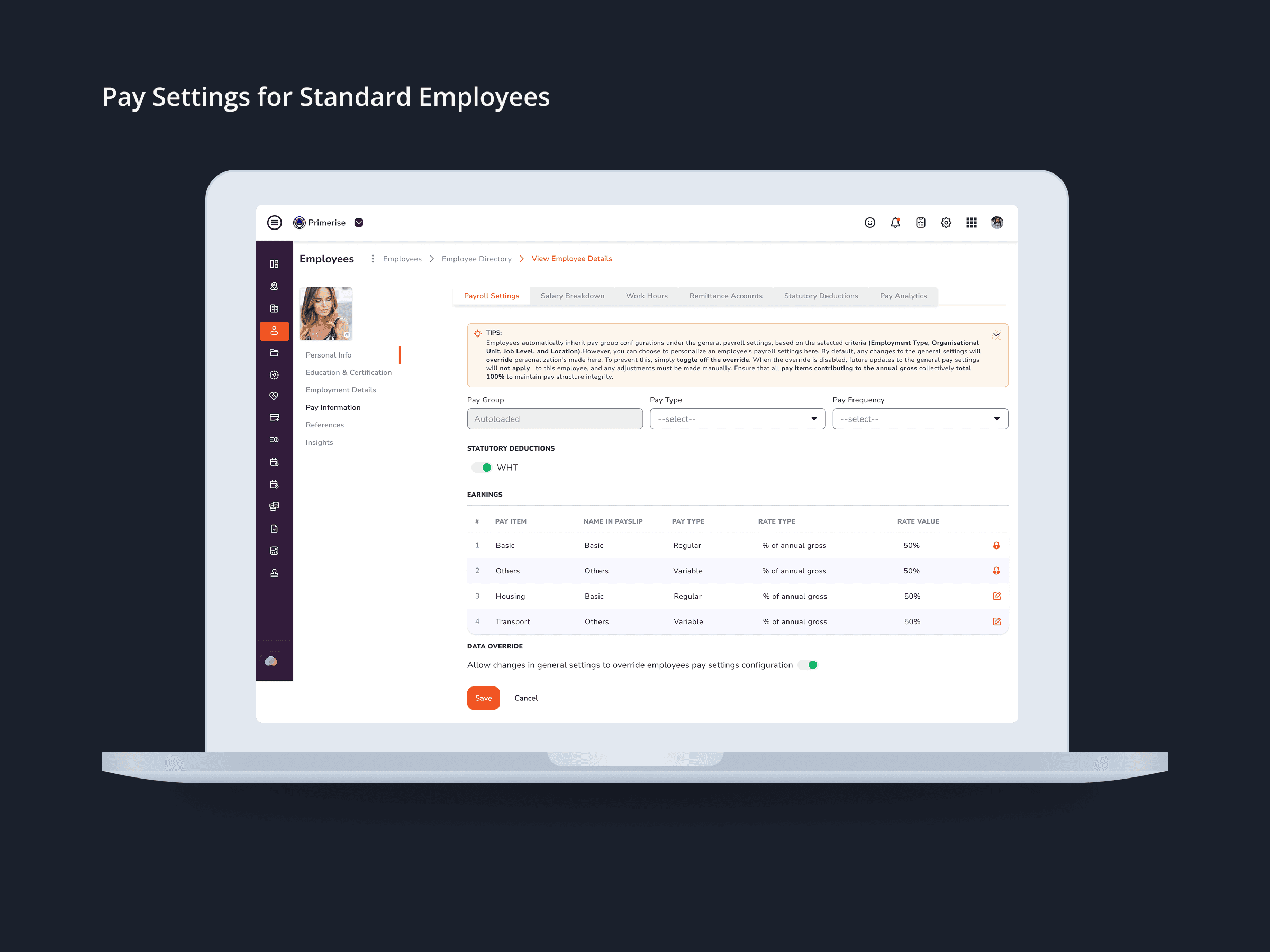
Designing Clarity into Complex Pay Configuration for a Multi-User HR Platform
UI Design · Component Design · Cross-functional Collaboration

MuleEx — Shipment Timeline (Admin View) Web · Admin HQ Users · Internal Ops Tool
Web UI