Designing Clarity into Complex Pay Configuration for a Multi-User HR Platform
UI Design · Component Design · Cross-functional Collaboration
Role
Product Designer
Industry
HR Technology · Payroll · Enterprise SaaS
Duration
Cloudenly (via Scelloo)
OVERVIEW
Cloudenly is an enterprise HR management platform built for organizations across sub-Saharan Africa. It handles everything from onboarding and leave management to payroll, tax compliance, and employee record-keeping — a full-cycle tool used daily by HR managers, payroll teams, finance admins, and employees.
At the centre of all of this sits a screen that looks simpler than it is: Pay Settings. It's where admins configure how individual employees and contractors are paid — their earnings structure, tax withholding, applicable deductions, and payment conditions. Get it right, and payroll runs smoothly. Get it wrong, and the consequences range from an incorrect pay-slip to a statutory compliance failure.
This project was a targeted UI update — not a full redesign — focused on making that screen more precise, more trustworthy, and more appropriate for the range of users who rely on it.
THE PROBLEM
A settings screen that couldn't distinguish between the people it was configuring
Cloudenly serves organizations with mixed workforces. A single company on the platform might have full-time staff, fixed-term employees, and independent contractors all active at the same time — each with different pay structures, different tax obligations, and different legal classifications.
The Pay Settings screen, however, treated them largely the same.
Fields that only apply to standard employees remained fully editable for contractors. There was no visual distinction between active and inactive configuration options, which created a quiet but serious risk: admins could enter data into fields that simply shouldn't apply to the person they were configuring. In payroll, that kind of error doesn't announce itself immediately. It surfaces later, in a payroll run, a contractor payment, or a tax filing.
Beyond the field logic, the screen had accumulated smaller friction points over time. The earnings register wasn't properly aligned, making it harder to scan multiple pay components at a glance. The top-level navigation tabs didn't fully reflect the configuration categories available. Withholding Tax (WHT) toggle functionality and override information existed in the system but lacked clear UI affordance — they were present but not surfaced in a way that gave admins confidence they were setting them correctly.
For a payroll admin working through dozens of employee configurations in a single session, these weren't minor annoyances. They were the kind of subtle, low-visibility issues that create errors no one catches until it's too late.
MY ROLE
Designer embedded in a cross-functional update
This update was initiated by Cloudenly's solution architect, who identified a set of functional and compliance-related gaps in the existing Pay Settings implementation. I was brought in to translate those requirements into UI decisions — working closely with the architect throughout to understand the business logic behind each change before designing how it should appear and behave on screen.
My involvement covered:
Reviewing the existing screen and identifying UI-level issues
Working with the solution architect to determine which fields should be inactive per employee type
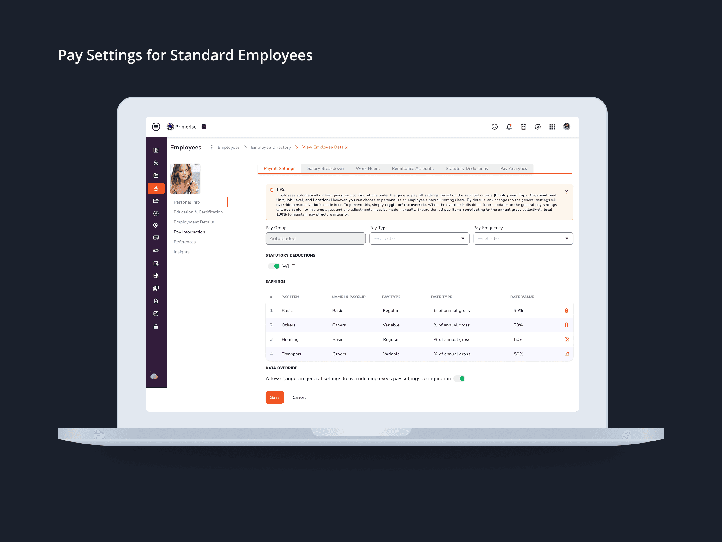
Designing and updating components for the earnings register, tab navigation, WHT toggle, contextual tips, and override information
Ensuring the screen clearly distinguished between independent contractor and standard employee configurations
Maintaining consistency with the existing Cloudenly design system throughout
This wasn't a case of receiving a brief and delivering a file. It was a collaborative process — understanding the why behind each change before deciding the how.
DESIGN DECISIONS
Every update had a clear reason behind it
1. Field state differentiation by employee type
The most important update was also the most structural. Certain earnings components, deductions, and override options only apply to standard employees — not independent contractors. Working with the solution architect to map out exactly which fields fell into which category, I updated the screen so that inapplicable fields are visually greyed out and inactive depending on the employee type being configured.
The principle here was simple: prevent the error before it happens, rather than catching it after. Inactive fields don't just communicate "this doesn't apply" — they remove the possibility of input entirely. That's the right call when the cost of a wrong entry is a misconfigured payslip or an incorrect tax deduction.
2. Expanded top-level navigation tabs
The original tab structure didn't reflect the full scope of what the screen covered. Important configuration categories were either missing from the top navigation or required scrolling to find. Adding tabs to surface these categories made the screen's structure immediately legible — admins could orient themselves at a glance and navigate directly to what they needed, without hunting.
3. Contextual tips integrated at the point of relevance
Pay Settings involves concepts that aren't immediately intuitive for every user who interacts with them. WHT thresholds, override conditions, and earnings classifications are second nature to a payroll specialist but opaque to an HR generalist who happens to be doing the configuration. Rather than leaving users to guess or escalate to support, I introduced contextual tip indicators directly within the screen, positioned at the point where the information was most needed. The goal was to make users feel informed in the moment — not to redirect them to documentation.
4. Earnings register alignment
The earnings list had visual inconsistency in how pay components, types, and amounts were displayed. Bringing the register into proper tabular alignment — consistent columns, clean spacing, predictable reading order — made it significantly easier to scan across multiple items quickly. For admins reviewing several employees' configurations in sequence, this kind of readability improvement has a compounding effect on both speed and accuracy.
5. WHT toggle and override information
Withholding Tax is a statutory obligation across most of the markets Cloudenly operates in. Having the WHT toggle buried or ambiguously positioned introduced real compliance risk — an admin might not notice it was misconfigured. Surfacing the toggle clearly, alongside the relevant override information, gave admins direct, visible control over a critical setting. If it's important to get right, it should be easy to find and easy to understand.
THE SCREENS
The four screens delivered cover both employee types in two states each:
Pay Settings — Independent Contractor (default view)
Pay Settings — Independent Contractor (warning/validation state)
Pay Settings — Standard Employee (default view)
Pay Settings — Standard Employee (warning/validation state)
The distinction between contractor and employee configurations is reflected directly in the UI — not just documented in a tooltip or enforced at the backend. What you see on screen accurately reflects what's applicable for that person.
OUTCOME
A more precise, more trustworthy configuration experience
The updates delivered a Pay Settings screen that more accurately reflects the complexity of what it's doing — and makes that complexity manageable rather than hidden.
Inactive fields for inapplicable employee types eliminate a whole class of potential input errors before they can reach a payroll run. A better-aligned earnings register and clearer tab navigation reduce the cognitive load of working through multiple configurations in a session. Surfacing the WHT toggle and override details as explicit, visible controls gives admins the confidence that statutory settings are correct — not just assumed. And contextual tips at the right moments mean users can resolve configuration questions on their own, without pulling in the solution architect every time.
None of these changes are dramatic in isolation. Together, they add up to a screen that HR teams and payroll admins can use with less hesitation and more accuracy.
REFLECTION
What this taught me about designing for compliance-adjacent products
Working on Cloudenly reinforced something I think is easy to underestimate in enterprise product design: the most important UX work is often invisible. The value here wasn't a striking new visual component — it was a field greyed out in the right context, or a toggle surfaced at the right moment. Good design in high-stakes tools means making the right thing easy and the wrong thing hard.
Collaborating directly with the solution architect also shifted how I approach cross-functional work. Understanding the business logic behind a UI decision — why a field should be inactive, not just how to make it look inactive — changes the quality of the decisions you make. You stop designing around assumptions and start designing around actual constraints.
For platforms like Cloudenly, operating across multiple African markets with varying labor laws and tax obligations, that precision in the configuration layer isn't a nice-to-have. It's what separates a tool people trust from one they have to double-check.


Other projects

MoveSmart — Multimodal Urban Mobility App
UX Research, Interaction Design, Design System, UI Design, Prototyping

Handy — On-Demand Handyman Service App
Designing a simple, trustworthy mobile experience that helps users find and book home repair professionals without stress or confusion

ClanCommerce — UI Refinement Across Core Admin Screens
UI Design, Interaction Design, Visual Refinement

MuleEx — Shipment Timeline (Admin View) Web · Admin HQ Users · Internal Ops Tool
Web UI

Delivery Completion & Customer Rating Modal — MuleEx
Mobile UI Design, Visual Redesign, Usability Improvements