Handy — On-Demand Handyman Service App
Designing a simple, trustworthy mobile experience that helps users find and book home repair professionals without stress or confusion
Role
UX/UI Designer
Industry
Home Services / On-Demand Services
Duration
Concept project — end-to-end mobile app design

OVERVIEW
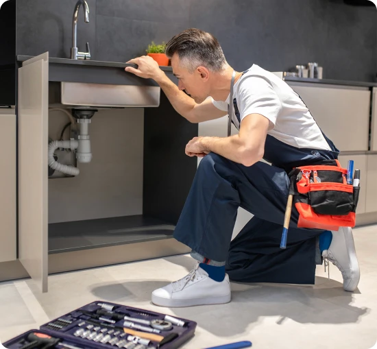
Finding a reliable handyman in Nigeria is a problem almost everyone has lived through. You ask around, someone gives you a number, the person shows up two days late or not at all, and you still have no idea whether the price you paid was fair. There's no receipt, no review, no recourse. You just move on and hope the next one is better.
Handy is a concept mobile app built to fix that. Not by adding more listings to an already noisy market, but by designing an experience that gives users something the informal market has never been able to offer: confidence. Confidence that the person coming to their home is qualified, that the price is transparent, and that booking them takes minutes, not phone calls.
The project covers the full user journey — from the first tap on the home screen to a confirmed payment — and every design decision along the way was made with one question in mind: does this help a stressed user move forward, or does it slow them down?
THE PROBLEM
Nigeria's home repair market runs almost entirely on trust networks — and if you're outside someone's network, you're on your own. There's no standard way to verify a handyman's skills, no pricing baseline to reference, and no platform with enough adoption to feel reliable. Most people default to whoever a friend used last, or whoever responds first on WhatsApp. The result is a market where availability consistently beats quality, and users have learned to lower their expectations before they've even made a booking.
This is a trust deficit problem, not a discovery problem. The challenge isn't that skilled artisans don't exist — they do. The challenge is that users have no way to distinguish a great one from a bad one before it's too late. And that uncertainty is expensive: it costs users time and money when jobs go wrong, and it costs skilled artisans bookings they should have won.
Handy's design brief was to close that gap. The measure of success wasn't a beautiful interface — it was whether a user could find, vet, and book a professional with enough confidence that they didn't feel the need to ask around first.
RESEARCH & APPROACH
The research phase drew on competitive analysis of existing service marketplace apps — both in Nigeria and internationally — desk research into informal labour market behaviour, and direct experience navigating this exact problem as a user. That last part mattered more than it might sound. Designing from lived frustration keeps you honest about what actually breaks down in the real world versus what looks like a friction point on a whiteboard.
The competitive review surfaced a consistent pattern worth paying attention to: most platforms optimise for supply breadth, which means listing as many providers as possible and leaving the filtering work to the user. This might feel comprehensive, but in a low-trust market it backfires. When users can't easily distinguish between providers, more options create more anxiety, not more confidence. The drop-off happens before anyone gets booked.
The design strategy for Handy inverted this. Rather than leading with volume, the focus was on progressive disclosure — surfacing the right information at the right moment, in just enough depth to support the next decision. Users shouldn't need to process everything upfront. They need enough to take the next step, and the step after that, until the booking feels like an obvious conclusion rather than a leap of faith.
The insight that shaped everything else came out of that framing: users booking a handyman are often dealing with an urgent, stressful situation. A leaking pipe. A power fault. A broken lock. The interface doesn't get to demand patience from someone who doesn't have any. It has to move fast and build trust at the same time — and those two things are usually in tension. Every design decision in this project was evaluated against both.
STYLE GUIDE
Before any screens were designed, a visual language was established to make sure the product felt coherent and intentional from the first tap to the last. Typography, colour, spacing, and component patterns were defined early — not as an afterthought, but as a foundation. In a trust-dependent product, visual consistency is part of the credibility. An interface that looks put-together signals, without words, that the service behind it is put-together too.
The style guide anchored decisions across the entire flow and made it possible to move quickly through screen design without relitigating basic choices each time.
USER JOURNEY
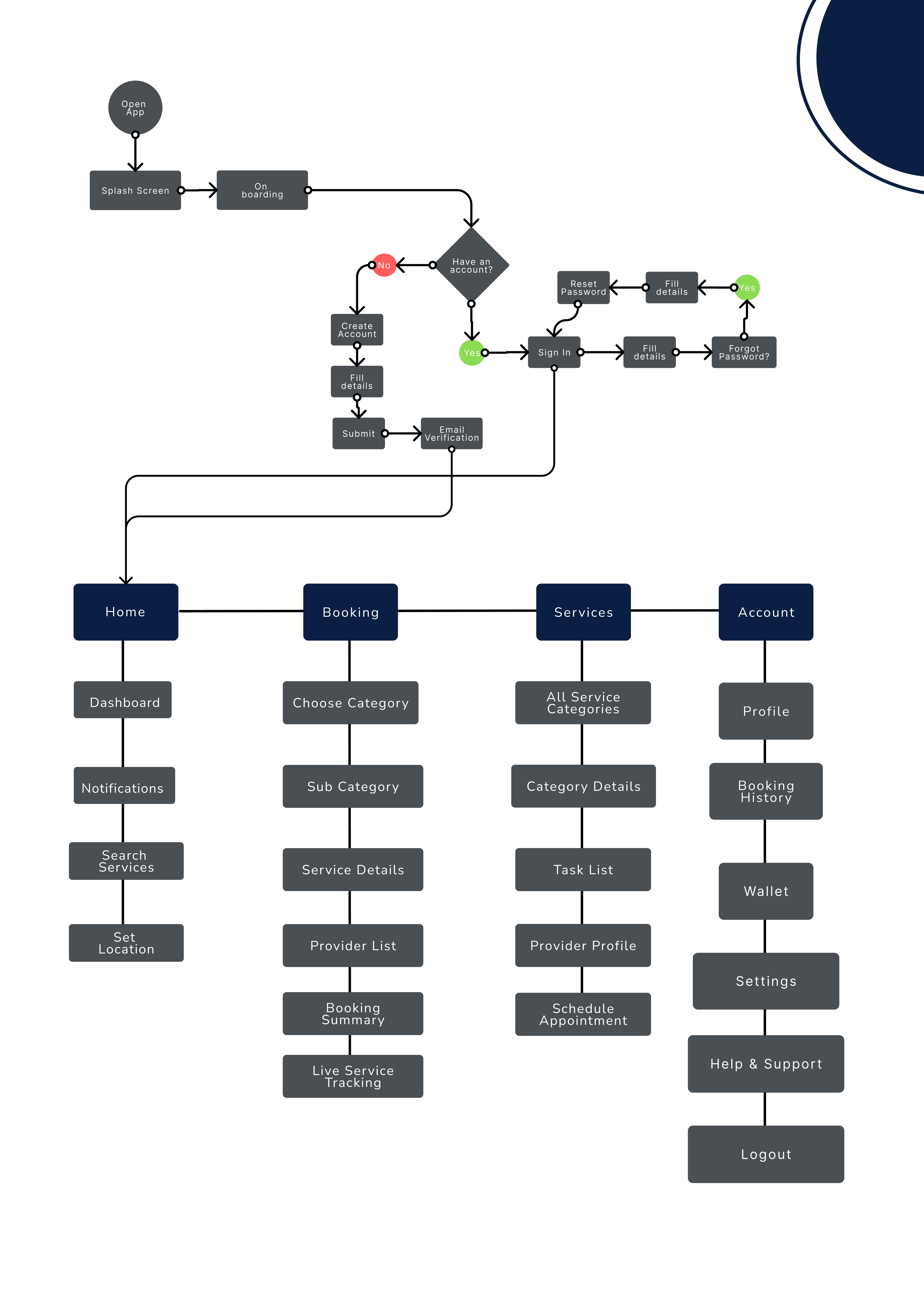
The app is structured around a single, linear path: discover → browse or search → select a professional → schedule → confirm → pay. The linearity is intentional. In a product where trust needs to build incrementally, a clear forward direction is a feature — it removes the cognitive overhead of figuring out what to do next, so users can spend that attention on the decisions that actually matter.
Two types of users enter differently but arrive at the same place. Users who know what they need can search from the home screen and land in results immediately. Users who aren't sure can browse by category until something clicks. Both paths converge at the same booking flow, which means the experience stays consistent regardless of how someone arrived — and no user feels like they took a wrong turn.
KEY SCREENS
Home Screen
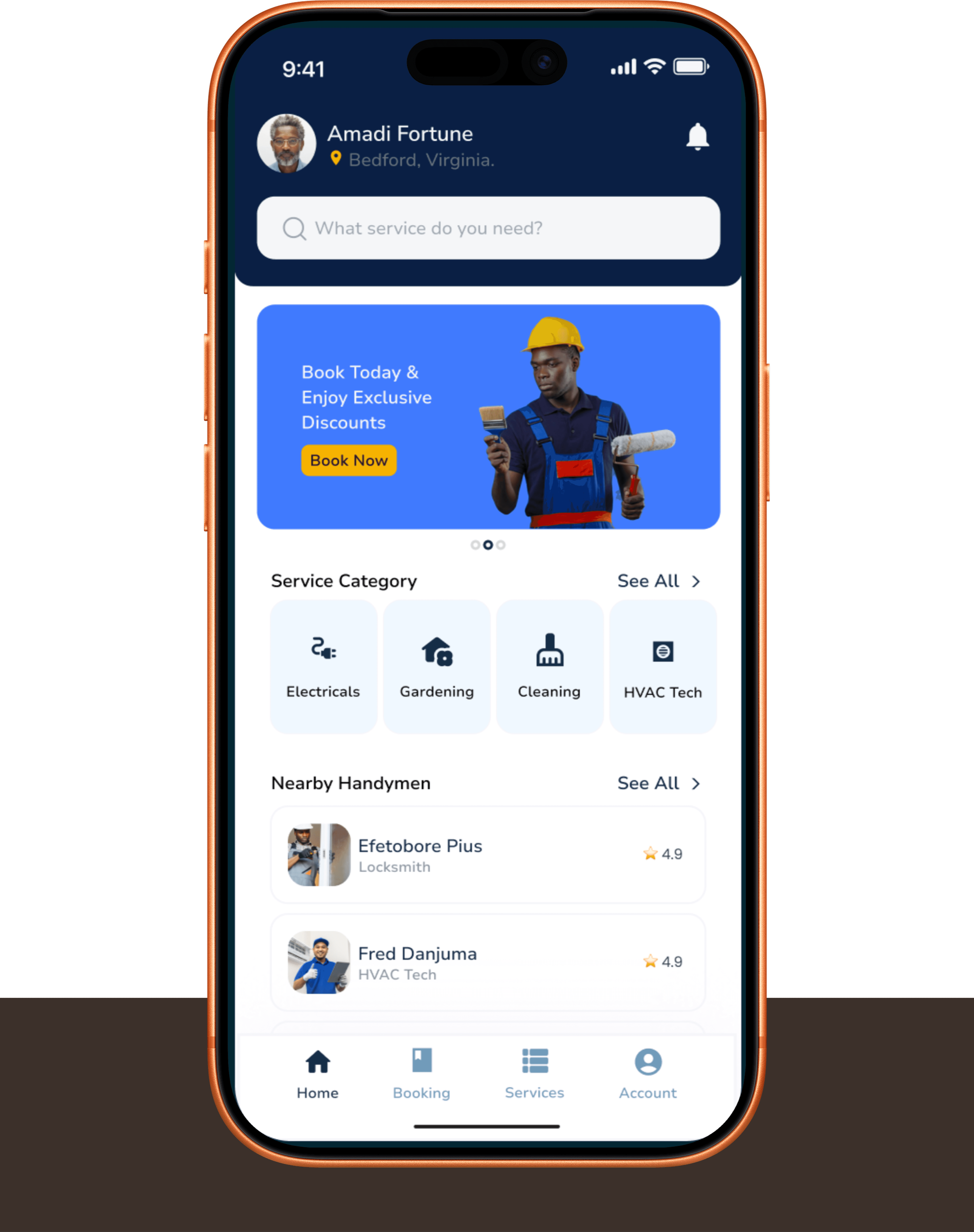
The home screen has one job: get users moving without making them think. It serves two distinct mental models at once, and it has to serve both well.
The first is the user who arrives already knowing what they need. For them, there's a prominent search bar at the top — type "plumber" or "electrician" and results appear immediately. No detours, no navigation hierarchy to work through. The second is the user who knows something is wrong but doesn't know the name for what they need. For them, there's a curated set of service categories below the fold, organised by type rather than by trade terminology, so users can navigate by recognition rather than recall. A Nearby Handymen section underneath uses location to surface available professionals immediately — specifically designed for the user who needs someone today.
The design decision to treat both modes as equally important, rather than defaulting to one and accommodating the other, was a deliberate call. A search-first home screen serves the power user but alienates the uncertain one. A category-first screen is reassuring for browsers but frustrating for anyone in a hurry. The home screen earns its layout by doing both without compromise.
Service Category & Subcategory
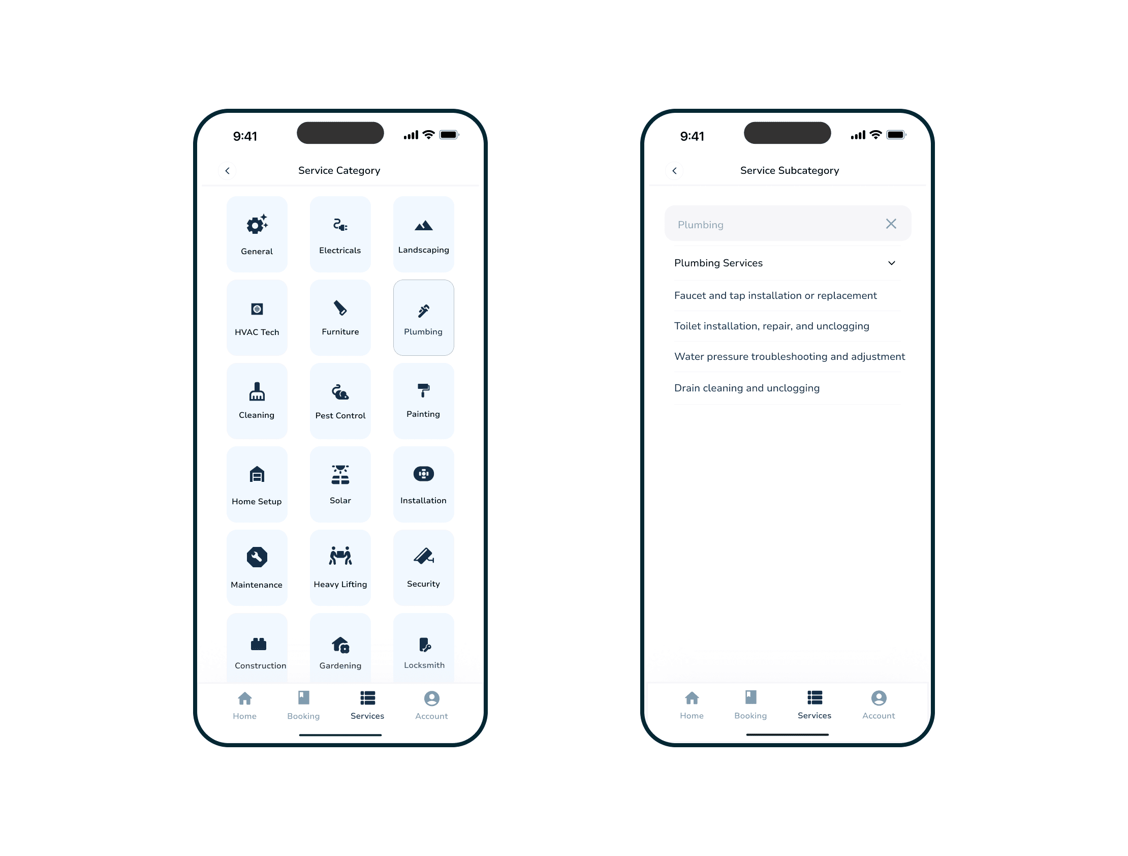
Not every user knows the technical name for what they need. Someone with a dripping tap might not know whether to search "plumbing" or "faucet repair" or "tap installation." Requiring that kind of precision upfront is a quiet but real barrier to booking.
The category navigation solves this by letting users navigate by symptom rather than trade classification. Fifteen top-level categories cover the full range of home services — from Electricals and Plumbing to Pest Control, Solar, and Heavy Lifting. Tapping a category opens a subcategory screen with specific tasks listed in plain language. Plumbing breaks into "Faucet and tap installation," "Toilet repair," "Water pressure troubleshooting," and so on. Users who didn't know what to search for can now recognise what they need.
This two-level hierarchy is a direct response to a real behaviour pattern: people describe home problems in terms of what they're experiencing, not what the fix is called. The navigation structure mirrors that. The business implication is also worth noting — when users can navigate to a service without needing specialised vocabulary, discovery abandonment goes down and the top of the funnel stays healthy.
Handyman Listings & Profile
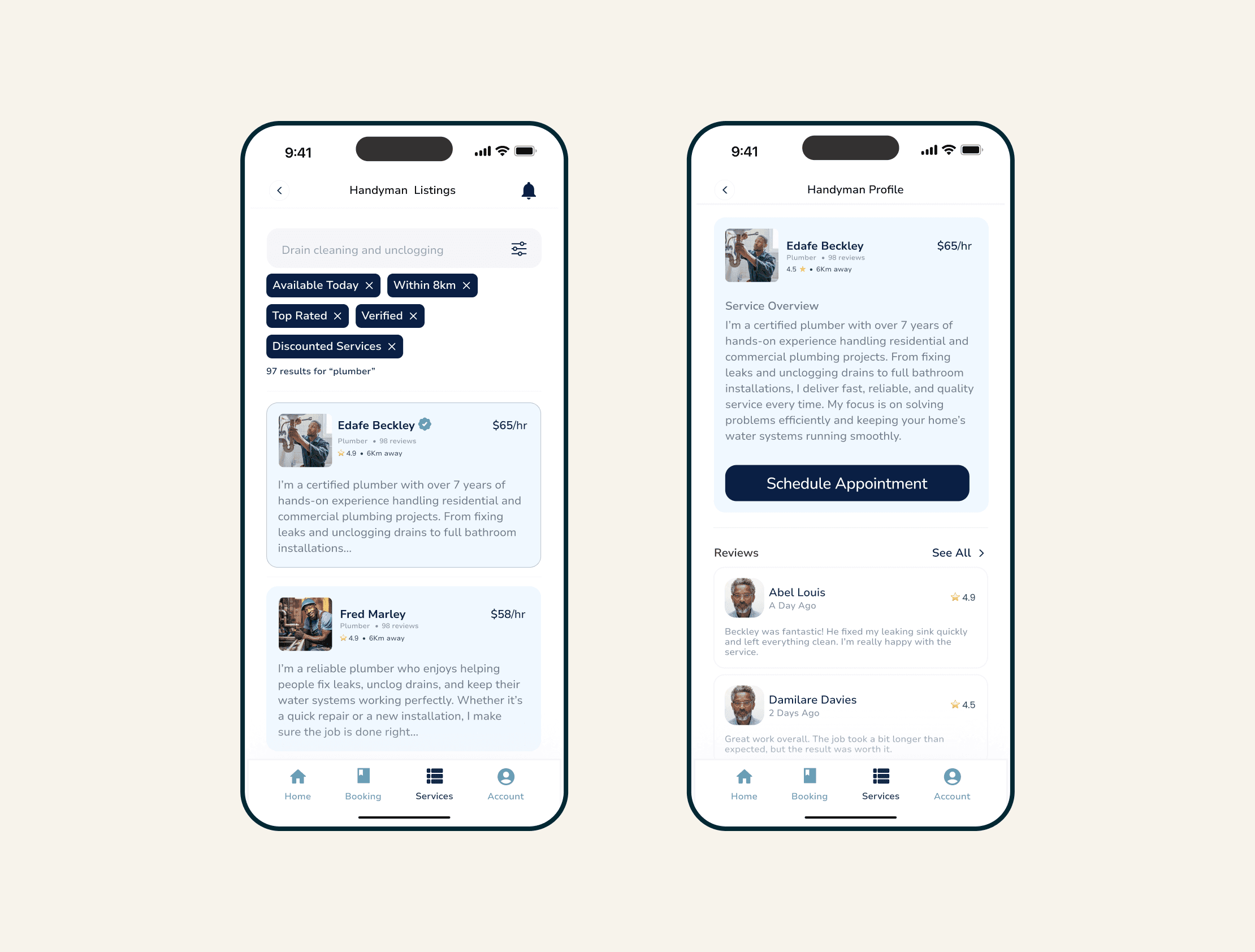
After selecting a service, users land on the listings screen — and this is where the product's trust proposition either works or doesn't.
Each listing leads with the four data points users are actually asking about: rating, experience level, distance, and price. These aren't arbitrary — they map directly to the internal checklist of someone making a decision about who to let into their home. Is this person good? Have they done this before? Can they get here? Can I afford it? The listings screen answers all four without making users hunt for the information.
Tapping a listing opens the profile screen, which goes deeper. Reviews, past jobs, stated skills, and availability are presented in a structure designed to replicate the kind of verification users would normally do informally — asking around, checking references, getting a feel for someone through second-hand accounts. The profile screen makes a stranger legible. That's the product's core promise, and this is the screen where it has to be delivered.
One design principle worth naming explicitly: most users won't read every review. But the presence of reviews, photos, and a job history functions as a trust signal even when skimmed. Credibility in a marketplace isn't always about the content of the evidence — sometimes it's simply about demonstrating that the evidence exists. The profile screen was designed with that in mind.
Core Booking Flow
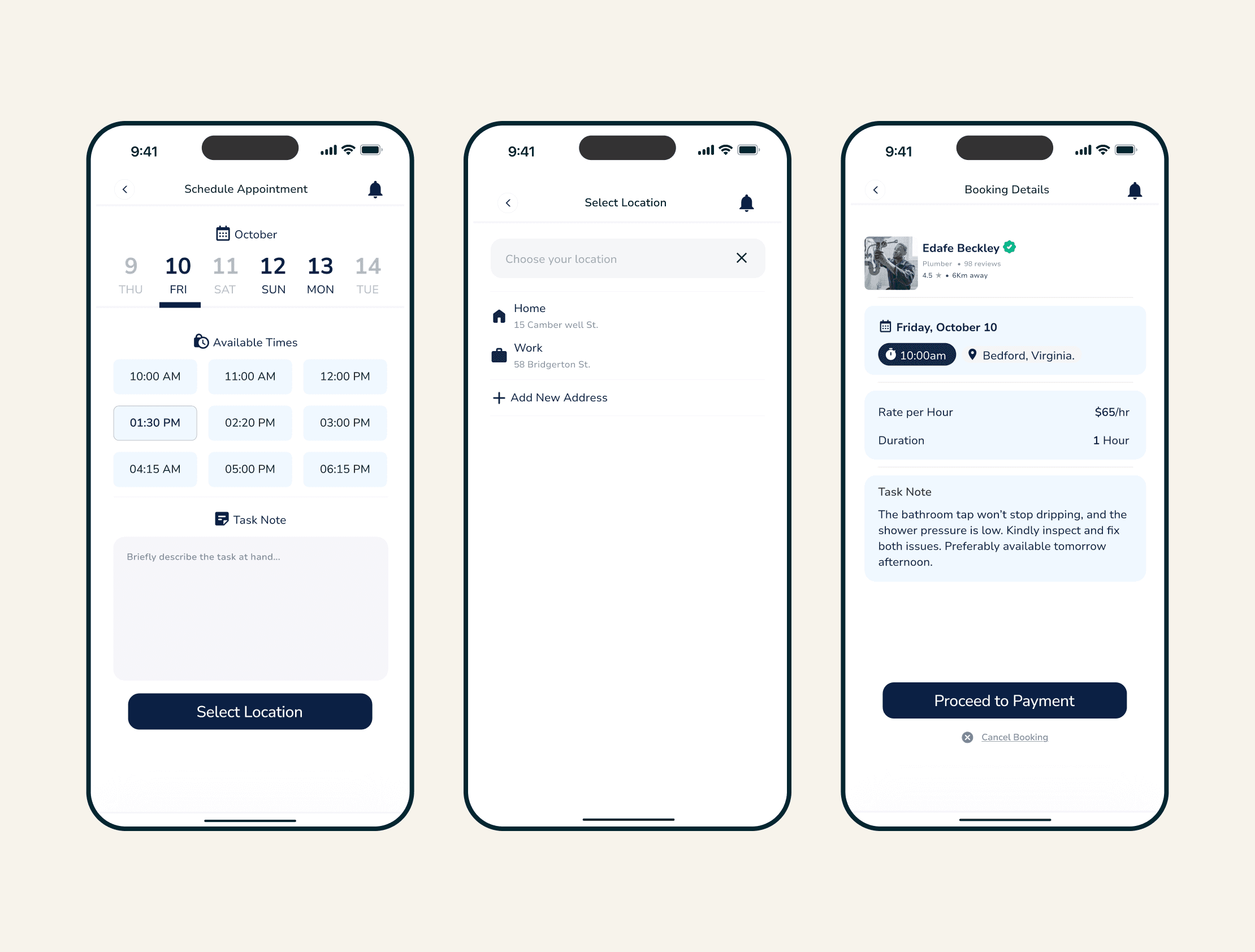
Once a user has chosen a professional, the booking flow takes over — and its job is to make commitment feel like a natural conclusion, not a moment of hesitation.
The flow runs across three steps. First, Schedule Appointment: a horizontal date picker paired with a tap-grid of available time slots. Scannable in a single gesture, no typing required. A task note field gives users space to briefly describe the job before moving on — useful for the handyman, and useful as a way to make users feel heard before anyone has spoken.
Second, Select Location: for returning users, this is a single tap to confirm a saved address. For new users, it's a quick add. In both cases, what could easily become a form-filling detour is kept to the minimum interaction required.
Third, Booking Details: this is the review screen, and it's doing more work than it might appear. It consolidates the selected professional, date, time, location, hourly rate, duration estimate, and task note into one view. The reason this screen exists isn't redundancy — it's because this is the moment users are most likely to second-guess. Just before commitment is when doubts surface, and the screen's job is to resolve them by making everything visible, editable, and clear before the final CTA appears. "Proceed to Payment" only shows once all the details are confirmed and in view.
The trade-off in a multi-step flow is always the same: more taps mean more opportunities to abandon. The response here was to make each step cognitively weightless — fast enough that users don't feel the length, but deliberate enough that confidence accumulates across the steps rather than evaporating at the end.
Payment & Confirmation
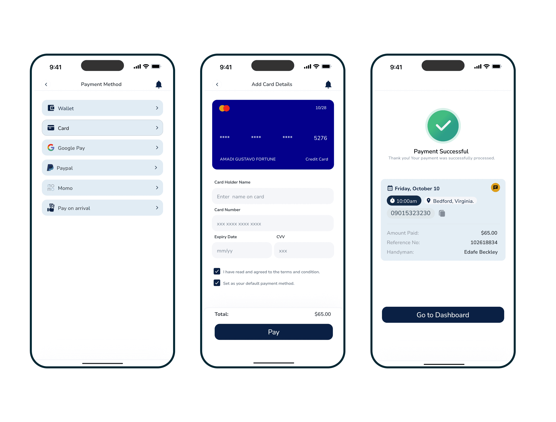
Six payment methods are available: Wallet, Card, Google Pay, PayPal, MoMo, and Pay on Arrival. The breadth is intentional and it's not just about user preference.
Payment method friction is one of the most consistent last-mile drop-off points in Nigerian consumer products. If a user reaches the payment screen and their preferred method isn't there, the booking is almost certainly lost — not to a competitor, but to inaction. Covering six methods reduces that risk significantly. But Pay on Arrival specifically is doing something different from the others. It's not just a payment option — it's a trust mechanism. It allows users who aren't yet comfortable paying a stranger upfront to still complete the booking. For a product whose job is to expand beyond existing trust networks, that option widens the addressable user base in a way that no amount of UX polish on the card entry screen can.
For users who do pay by card, the entry screen includes a live card preview that updates in real time as details are typed. It's a small detail, but it matters at a high-anxiety moment: it confirms that input is being registered correctly and creates a visual sense of control before the final submission. The flow ends with a Payment Successful screen that confirms the amount paid, the booking reference, the assigned handyman, and the appointment details in one view. The user leaves knowing exactly what happens next.
REFLECTION
The biggest shift in my thinking from this project was understanding that structure is a form of empathy.
When someone's pipe is leaking or their power has gone out, they're not in a patient, exploratory headspace. They need clarity, fast. The worst thing an interface can do in that moment is make them think harder. Every decision in Handy — the binary category grid, the tap-based time picker, the consolidated booking details screen — was made in service of reducing cognitive load at exactly the moment when the user has the least patience for friction.
If I were to extend this further, the two areas I'd prioritise are a real-time booking status screen and a post-service rating flow on the user side. The status screen matters because the window between confirmation and arrival is currently a trust black box — the user has committed, the professional has been notified, and then nothing happens visibly. That gap is where anxiety grows. Closing it with even basic status updates (confirmed, en route, arrived) would significantly improve the post-booking experience without requiring a major feature build.
The rating flow matters because trust in a marketplace is cumulative. Every review added by a user after a completed job makes the next user's decision slightly easier. Designing that feedback loop well — making it fast, low-effort, and worth completing — is one of the highest-leverage things a product like this can do for long-term retention and supply quality.
More broadly, this project reinforced something I now carry into everything I design: the hardest problem in marketplace products isn't the interface. It's the trust architecture. The screens are just where that architecture becomes visible.

Stage 4. User Feedback & Refinement
Facilitated user testing with a diverse group of app users, gathering insightful feedback on the redesign. This phase was crucial in identifying unforeseen usability issues and validating the effectiveness of the new design elements. Iterative refinements were made based on this feedback, fine-tuning the app's interface to maximize user satisfaction and engagement.
Stage 5. Implementation & Launch Support
Collaborated closely with the development team to ensure a smooth transition from design to implementation. Provided ongoing support and guidance during the development phase, addressing any design-related challenges that arose. Played a key role in the app's successful relaunch, monitoring user feedback and engagement post-launch to inform future updates.
Outcomes
The redesigned fitness tracker app received overwhelmingly positive feedback from users, who praised its improved usability, engaging design, and motivational features. The project was a significant learning opportunity, enhancing my understanding of user-centric design principles and the impact of design on user behavior and app retention.
Other projects

MoveSmart — Multimodal Urban Mobility App
UX Research, Interaction Design, Design System, UI Design, Prototyping

ClanCommerce — UI Refinement Across Core Admin Screens
UI Design, Interaction Design, Visual Refinement
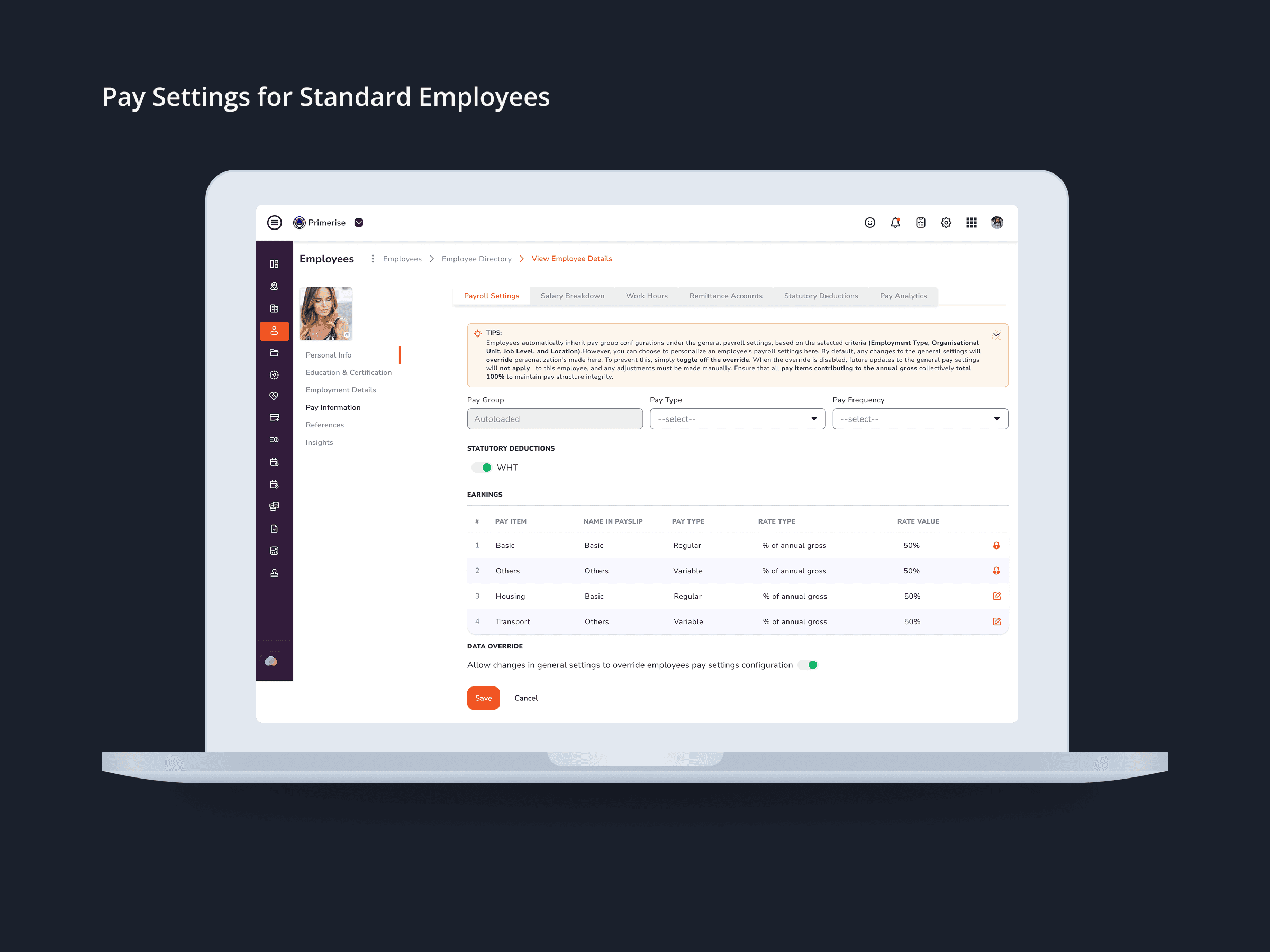
Designing Clarity into Complex Pay Configuration for a Multi-User HR Platform
UI Design · Component Design · Cross-functional Collaboration

MuleEx — Shipment Timeline (Admin View) Web · Admin HQ Users · Internal Ops Tool
Web UI

Delivery Completion & Customer Rating Modal — MuleEx
Mobile UI Design, Visual Redesign, Usability Improvements