MoveSmart — Multimodal Urban Mobility App
UX Research, Interaction Design, Design System, UI Design, Prototyping
Role
Product Designer
Industry
Urban Mobility / Transportation Technology
Duration
Personal Concept

OVERVIEW
The Netherlands is one of the best places in the world to move around without a car. Cycling infrastructure is world-class, public transit is extensive, and shared mobility options are widely available. On paper, getting from A to B sustainably and efficiently should be straightforward.
In practice, it rarely is. A commuter planning a journey that involves cycling to a train station, catching two connections, and walking the last stretch to a meeting has to hold all of that in their head — or piece it together across multiple apps that don't talk to each other. Google Maps gives one view. The NS app gives another. 9292 gives a third. None of them show the full picture in a single, comparable, decision-ready format. And none of them make the environmental trade-off of each choice visible without the user going looking for it.
MoveSmart is a concept mobile app designed for that gap. It brings multimodal journey planning — walking, cycling, public transit, shared mobility — into a single experience, built around the moments where urban commuters actually need help: choosing between routes, understanding what each option costs in time and transfers, and making those decisions without being overwhelmed by the interface doing the deciding for them.
This project was also a deliberate signal. Designing a mobility product specifically for the Dutch urban context meant researching how people actually move in cities like Amsterdam and Utrecht, understanding the role cycling plays as a primary mode rather than a last resort, and designing for a user base where sustainability isn't a marketing angle — it's a genuine priority.
THE PROBLEM
Multimodal travel is cognitively expensive in a way that single-mode travel isn't. When you're driving or cycling the whole way, the decision is simple. When you're combining modes — especially in an unfamiliar city, or under time pressure — the number of variables multiplies fast. Which route is fastest? Which one has the fewest transfers? Is the extra ten minutes on the slower route worth it to avoid a connection with a tight window? How does cycling part of the way change the carbon footprint?
Current navigation tools don't make this easier — they make it differently hard. Apps optimized for speed bury the trade-offs. Apps that show multiple route options present them in formats that require users to do the comparison work themselves. Environmental impact, where it's shown at all, is typically an afterthought rather than a decision input.
The result is that urban commuters — especially those trying to travel sustainably — are left doing mental arithmetic at exactly the moment they should be able to trust their tools. The journey hasn't even started and the experience is already stressful.
MoveSmart was designed around three specific failure points in that experience: the friction of entering a destination and getting to useful results fast, the cognitive cost of comparing route options without a clear framework for the trade-offs, and the absence of CO₂ visibility at the moment it could actually influence a decision.
DESIGN PROCESS
The process started with mapping the end-to-end journey a commuter goes through — not just the app interactions, but the mental model underneath them. What does a user already know when they open the app? What decisions are they trying to make? What information do they need at each step, and in what order?
From that mapping, a primary happy path emerged: destination entry → route comparison → route selection → live navigation → trip completion. This became the spine of the prototype. Every other interaction in the app — edge cases, alternative flows, accessibility considerations — was designed to support that path rather than compete with it.
Full user flows, wireframes, and interaction details are documented in the Figma case study.
The design constraint I held throughout was this: at every decision point, the interface should give users exactly enough information to move forward confidently, without more. Multimodal journey data is inherently complex. The temptation in products like this is to surface everything — every route variant, every transfer detail, every real-time update — in the name of completeness. That instinct usually produces screens that are technically comprehensive and practically overwhelming. MoveSmart was built on the opposite principle: clarity at decision points, detail available on demand.
KEY SCREENS
Search and destination entry — removing friction at the start
The entry point to any navigation app sets the tone for everything that follows. If getting to route options takes too many taps or too much typing, users disengage before they've seen what the product can do.
The search and destination entry flow in MoveSmart was designed to minimize that friction. Recent destinations surface immediately without input, so returning users can reselect a common journey in a single tap. Search results appear progressively as the user types, reducing the time between intent and action. The interface doesn't ask for more than it needs at this stage — the mode preferences, time constraints, and accessibility requirements can all be adjusted later. Getting to route options fast is the priority.
The design decision to keep this screen light was deliberate. In a product whose value is in route comparison, the destination entry step is infrastructure — it should be invisible in the sense that it never feels like an obstacle.
Route selection and comparison — a framework for trade-offs
This is the screen where MoveSmart either earns its place or doesn't. Route comparison is the core decision moment in any journey-planning product, and it's the place where most existing tools fall short — not because they lack data, but because they present it in formats that make comparison difficult.
MoveSmart's route cards were designed around the specific trade-offs urban commuters actually care about: total journey time, number of transfers, modes involved, cost, and CO₂ impact. Each card surfaces all five in a scannable format, so users can compare options without having to tap into each one individually. The fastest route, the most sustainable route, and the simplest route (fewest transfers) are visually differentiated — not with hidden labels but with enough hierarchy that the difference registers at a glance.
The CO₂ figure sits alongside time and cost as an equal decision input, not a footnote. For users in a market where sustainable travel is a genuine value rather than a aspirational one, that placement matters. It signals that the product takes sustainability seriously enough to put it at the decision point rather than burying it in a details screen.
Live navigation and trip summary — clarity in motion
Once a route is selected, the design priorities shift. The user is moving. They're not comparing options anymore — they're executing a plan, and the interface needs to support that without demanding attention.
The live navigation screen minimizes visual complexity to the information the user needs right now: the next action, the time to that action, and the mode they're currently in. Everything else recedes. Transfer alerts surface with enough lead time to be useful without being disruptive. The interface updates cleanly as modes change — from cycling to transit, from transit to walking — without requiring the user to reconfigure anything.
The trip summary screen at the end of the journey closes the loop: total time, distance, modes used, and CO₂ saved relative to a car journey. This last figure is a reinforcement mechanism as much as a data point — it gives users who chose a sustainable route a concrete outcome to associate with that choice, which matters for the kind of habitual behavior change that makes a mobility product genuinely useful over time.
👉 See annotated wireframes and
👉 interaction breakdowns in Figma.
DESIGN SYSTEM
A lightweight design system was built alongside the screens to ensure consistency across the full journey — from destination entry through to trip completion. The system defines colour roles tied to transport modes, a typography hierarchy calibrated for readability in motion and in variable light conditions, spacing logic that keeps the interface legible on smaller screens, and reusable components for route cards, transfer indicators, and navigation states.
Building the system in parallel with the screens rather than after them meant that decisions made early — how to represent a cycling leg versus a transit leg, how to distinguish an active step from an upcoming one — were codified and consistent by the time the full prototype was assembled. In a product where users are reading information quickly and sometimes in motion, that consistency isn't aesthetic — it's functional.
👉 Full design system documentation available in Figma.
PROTOTYPE
The prototype demonstrates the primary happy path from destination entry to trip completion. Key decision points — destination selection, route comparison, mode transition during navigation — are fully interactive. Supporting flows and edge cases are documented in the Figma case study alongside annotated wireframes and interaction breakdowns.
The scope was kept tight deliberately. A prototype that tries to demonstrate every possible flow typically ends up demonstrating none of them well. The goal here was to make the core experience — the thing MoveSmart does that nothing else does as well — feel real and testable, and let the Figma documentation carry the detail beyond that.
🔗 Link to Figma prototype
REFLECTION
MoveSmart taught me something about designing for values as much as for behavior. Sustainability isn't just a feature you add to a mobility app — it's a design position. Where you place the CO₂ figure on a route card, whether it appears at the comparison stage or only in a trip summary, whether it's framed as a cost or a saving — all of those choices communicate what the product thinks matters. Getting them right requires a point of view, not just a preference test.
The other thing this project reinforced is the discipline of restraint in information-heavy products. Multimodal journey data is genuinely complex. The data exists to show users far more than MoveSmart surfaces at any given moment. But showing more doesn't help a user decide faster — it usually does the opposite. Knowing what to leave out, and designing the access to deeper detail without making it unavoidable, is a harder problem than knowing what to put in. That's a principle I'd apply to any product operating in a similarly data-rich context.
If I were to extend this into a next iteration, the two areas I'd prioritize are accessibility preference inputs at the route selection stage — so users with mobility considerations can filter routes before they appear rather than after — and personalization for frequent commuters, where the app learns common journeys and surfaces them intelligently without being asked. Both would bring the product closer to the ambient, low-effort experience that makes a mobility tool something people reach for automatically rather than occasionally.


Other projects

Handy — On-Demand Handyman Service App
Designing a simple, trustworthy mobile experience that helps users find and book home repair professionals without stress or confusion

ClanCommerce — UI Refinement Across Core Admin Screens
UI Design, Interaction Design, Visual Refinement
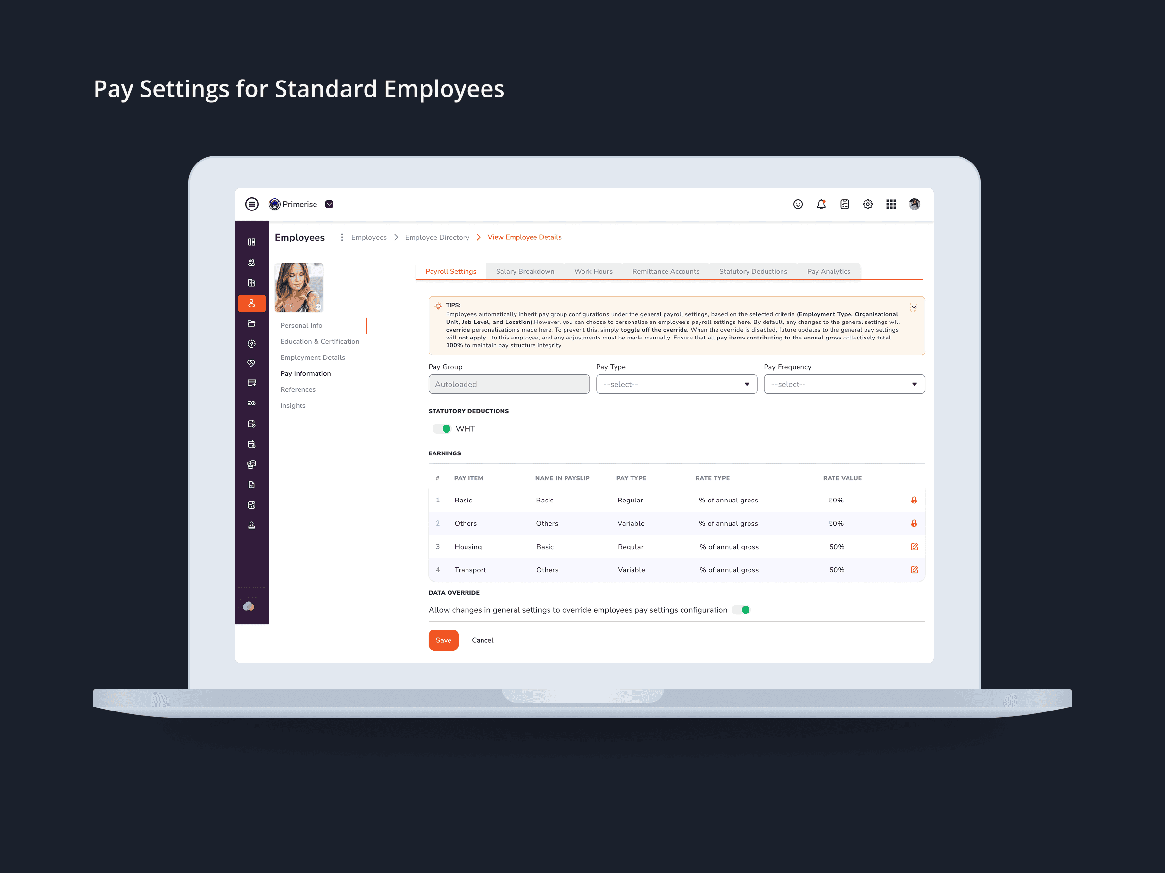
Designing Clarity into Complex Pay Configuration for a Multi-User HR Platform
UI Design · Component Design · Cross-functional Collaboration

MuleEx — Shipment Timeline (Admin View) Web · Admin HQ Users · Internal Ops Tool
Web UI

Delivery Completion & Customer Rating Modal — MuleEx
Mobile UI Design, Visual Redesign, Usability Improvements